

Abeo Tourism Service
Company: Odigo (In service of MHCI Capstone Project at Carnegie Mellon University)
Duration: 8 months
My Role: Designer — User research, concept development, graphic design, UX/UI design
Team: 3 Designers

Odigo’s goal for participating in the 2016 Masters of Human-Computer Interaction Capstone Project was to increase their footprint in the Japanese tourism industry.
Odigo's itinerary planning tool is perfect for helping English-speaking tourists plan their trip to Japan, but it didn’t provide them with much help once they were in the country. So, Odigo wanted to do something to help tourists while they were in the country and initially came to MCHI Capstone project with the idea of creating a kiosk that could help an English-speaking tourist in some fashion. They wanted a kiosk because it was something they could pilot at a shopping complex near Osaka called Expo City. Their biggest shareholder had just bought the naming rights to a Ferris wheel that was opening that summer at Expo City. Their hope was to introduce the kiosk at the opening of the Ferris wheel to piggyback off of the momentum it would provide.
The Capstone team’s goal was to figure out how to provide value to an English-speaking tourist during their journey.
After three months of research, including visiting the cities of Tokyo, Osaka, and Kyoto, we found that Expo City appealed to local Japanese tourists but was not enough of a draw for the foreign tourists in comparison with the offerings of cities like Kyoto and Tokyo. We recommend that a physical tool like a kiosk at Expo City would have a little return on investment for Odigo. Our research uncovered some promising opportunity areas for enhancing the English-speaking tourist's journey. Odigo agreed with our findings, and we focused on developing solutions for those opportunity areas.
TEAM MEMBERS
John DeGore, Katherine Habeck, Angela Mu Liu, Katie Sawaya, Ajayan Subramanian
Abeo, a mobile application that provides just-in-time guides for English-speaking tourists in Japan.
The result of our work led to the development of a high fidelity prototype and a long term plan for an app called Abeo. Abeo helps tourists get out of sticky logistical tasks that currently cause anxiety and obstruct enjoyment of Japan. It accomplishes this through three key features.
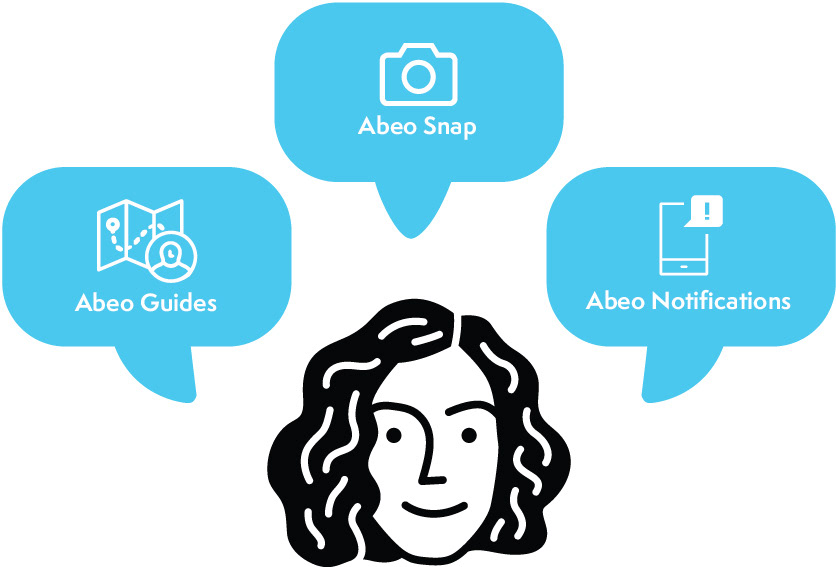
Abeo Guides provide in-the-moment help so tourists can stop digging for information.
When tourists approach an Odigo-recognized spot, they can access the Abeo app to view concise step-by-step instructions called Guides. Abeo Guides walk tourists through tasks at the specific Odigo spot. The app only features Abeo Guides related to the tourist's current situation on the home screen, preventing the tourist from having to dig.
Abeo Snap lets tourists use their camera to ask questions and get answers.
Western tourists visit Japan to participate in Japanese culture. However, a lack of knowledge about what is in front of them often impacts their ability to participate. They often see things in the environment that they cannot translate, name, or identify which makes entering keywords into search engines very difficult. Abeo Snaps uses image recognition technology to help tourists find related Guides. Tourists can take a photo with Abeo Snap to instantly identify objects and places to get the answers they need.
Abeo Notifications let tourists spend less time glued to their devices.
Tourists do not want to sift through their travel guides and apps in every confusing situation only to find a lack of relevant information. Abeo Notifications alert users when a relevant Guide is available. Tourists can explore Japan freely and refer only to their phones when Abeo detects they need help at their current location.
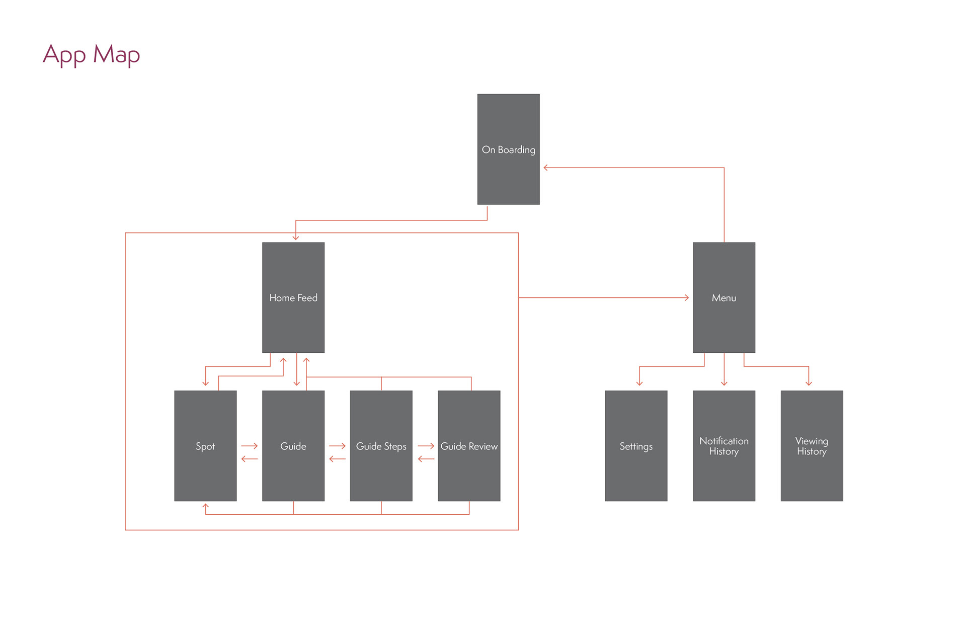
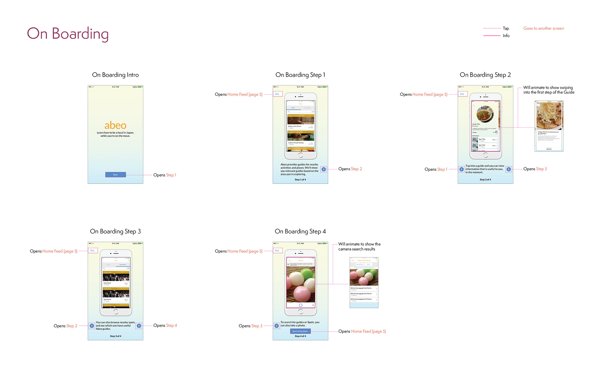
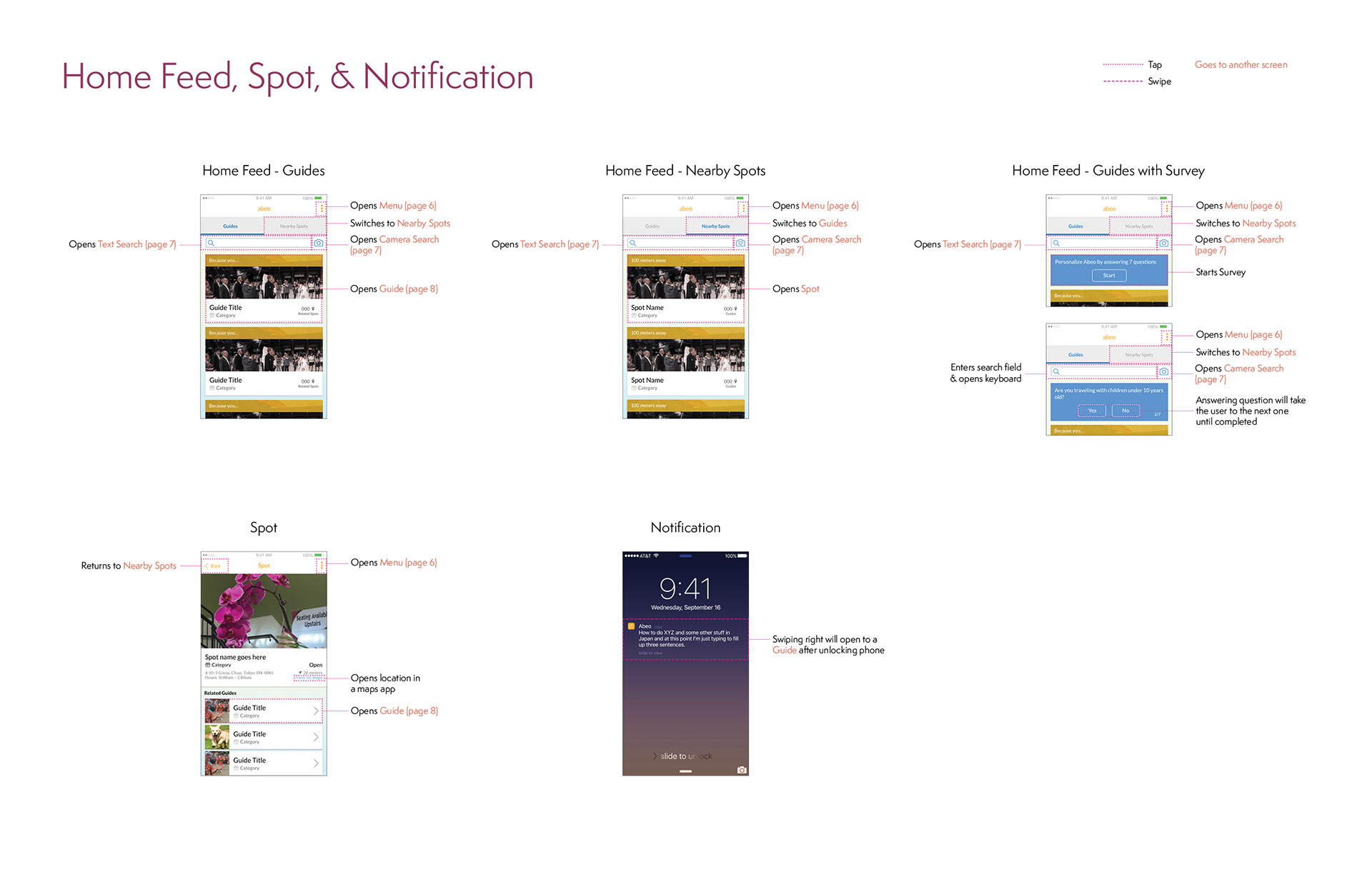
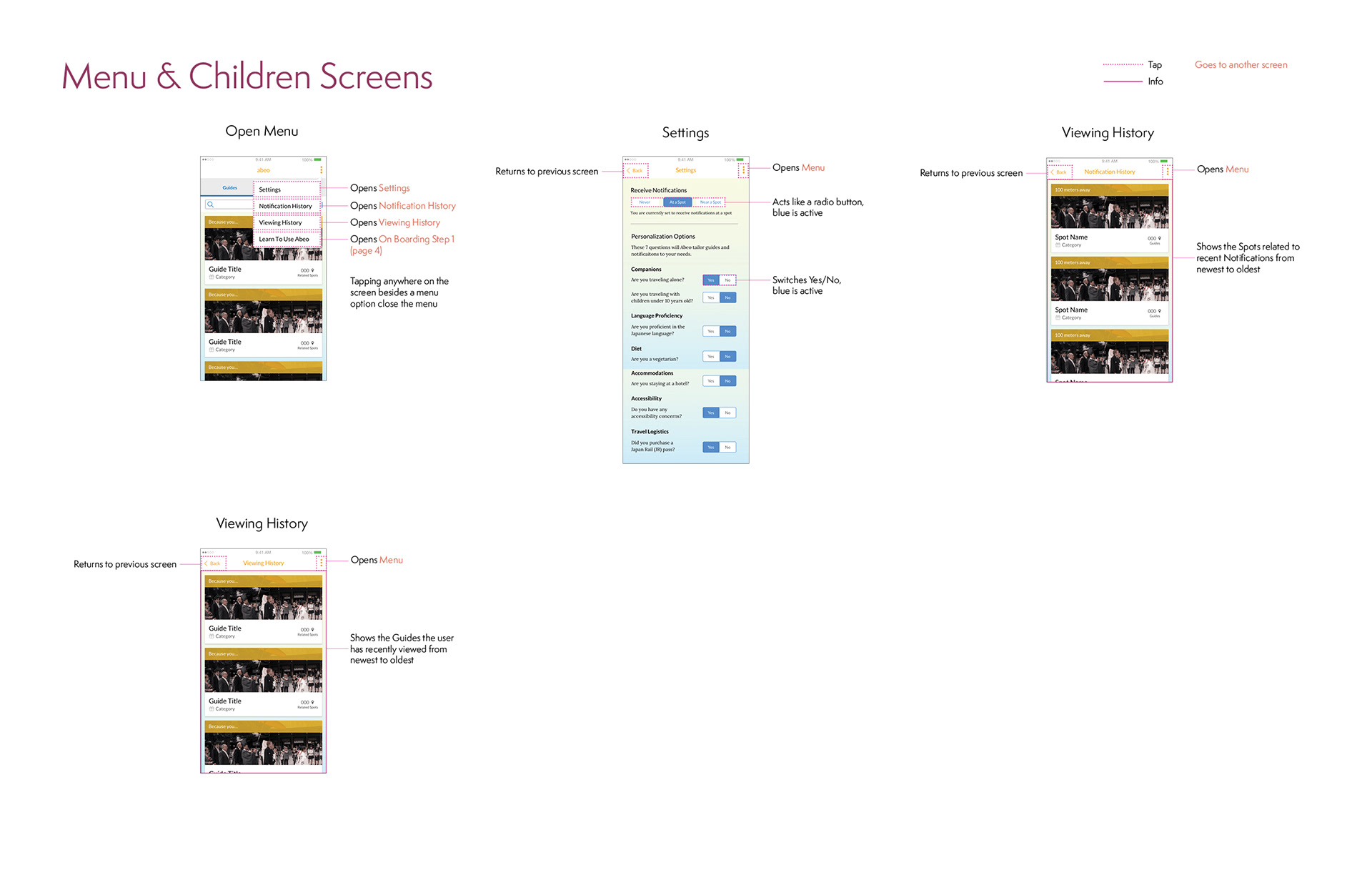
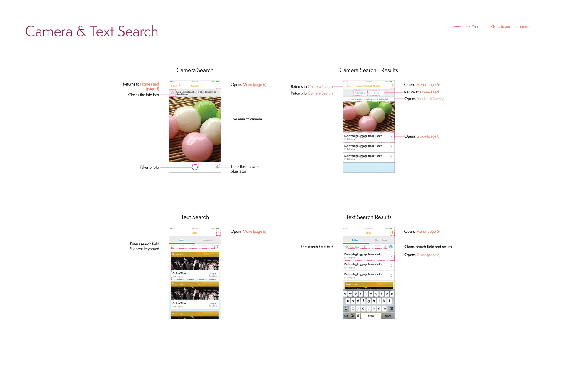
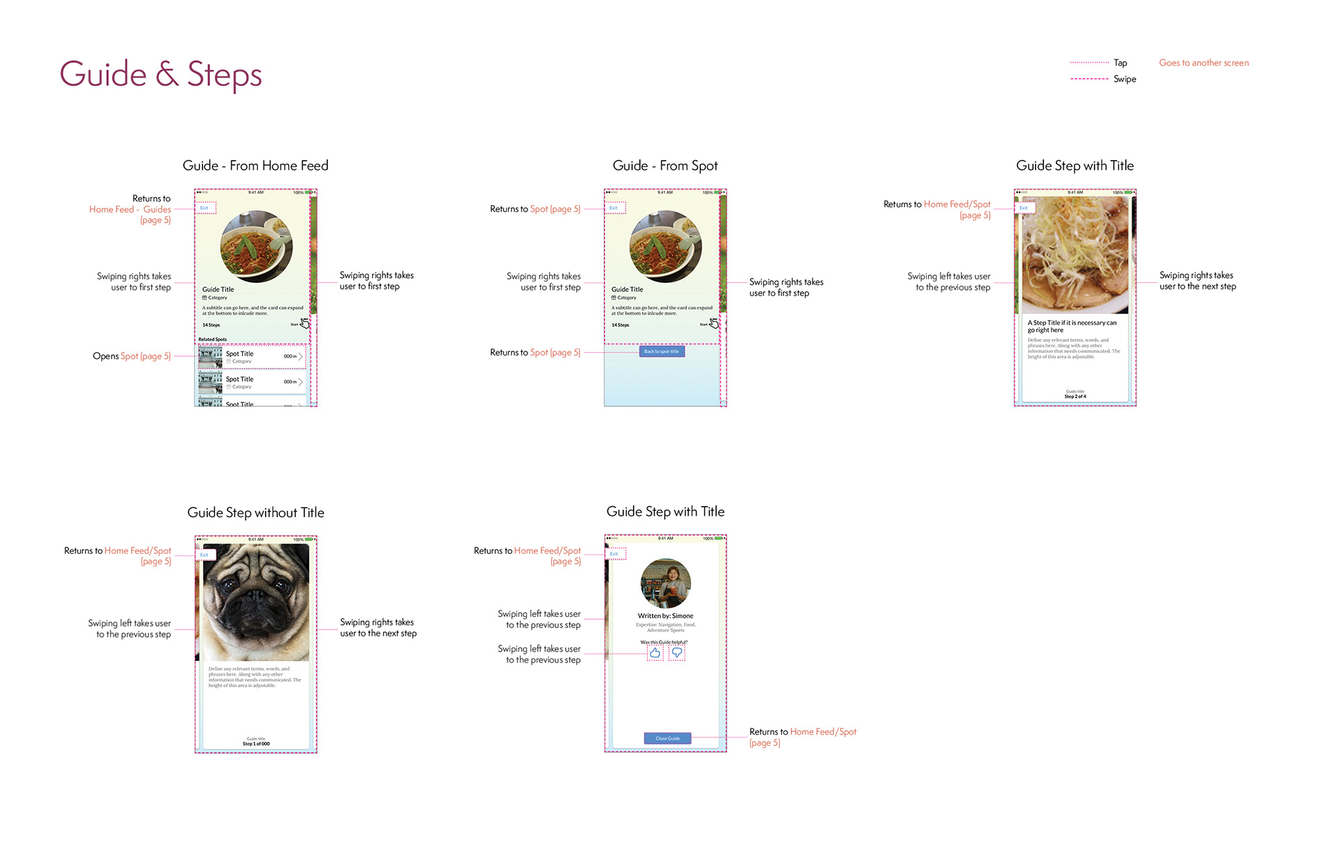
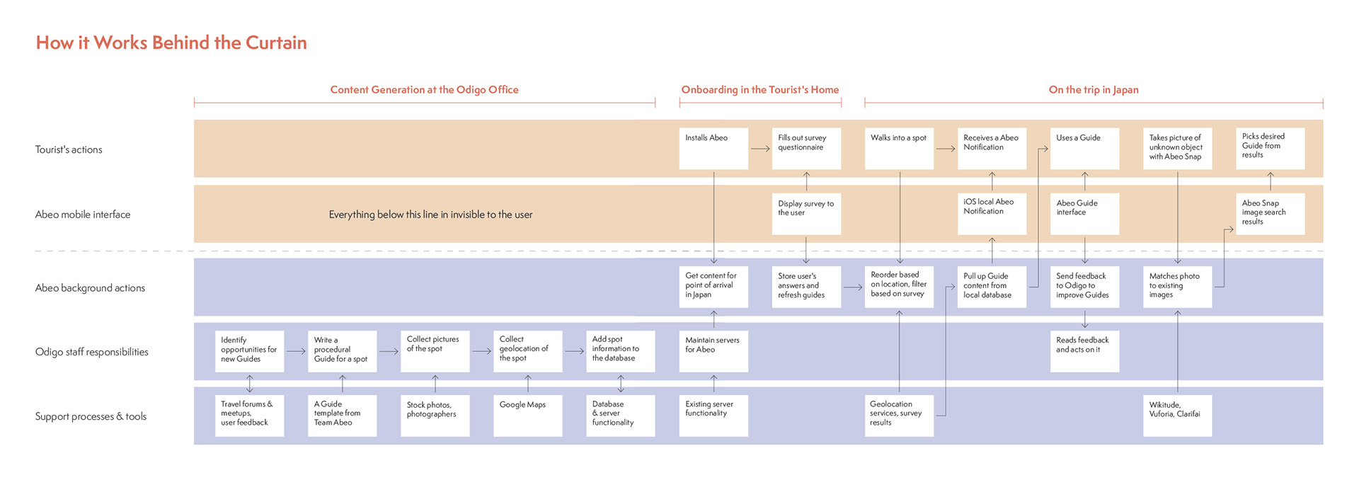
Below are pages from the App Map & Wireframes document we provided to Odigo as part of our final deliverable, and a copy of the Service Blueprint from our Summer Booklet which you can find below. You can view the full App Map & Wireframe PDF here.
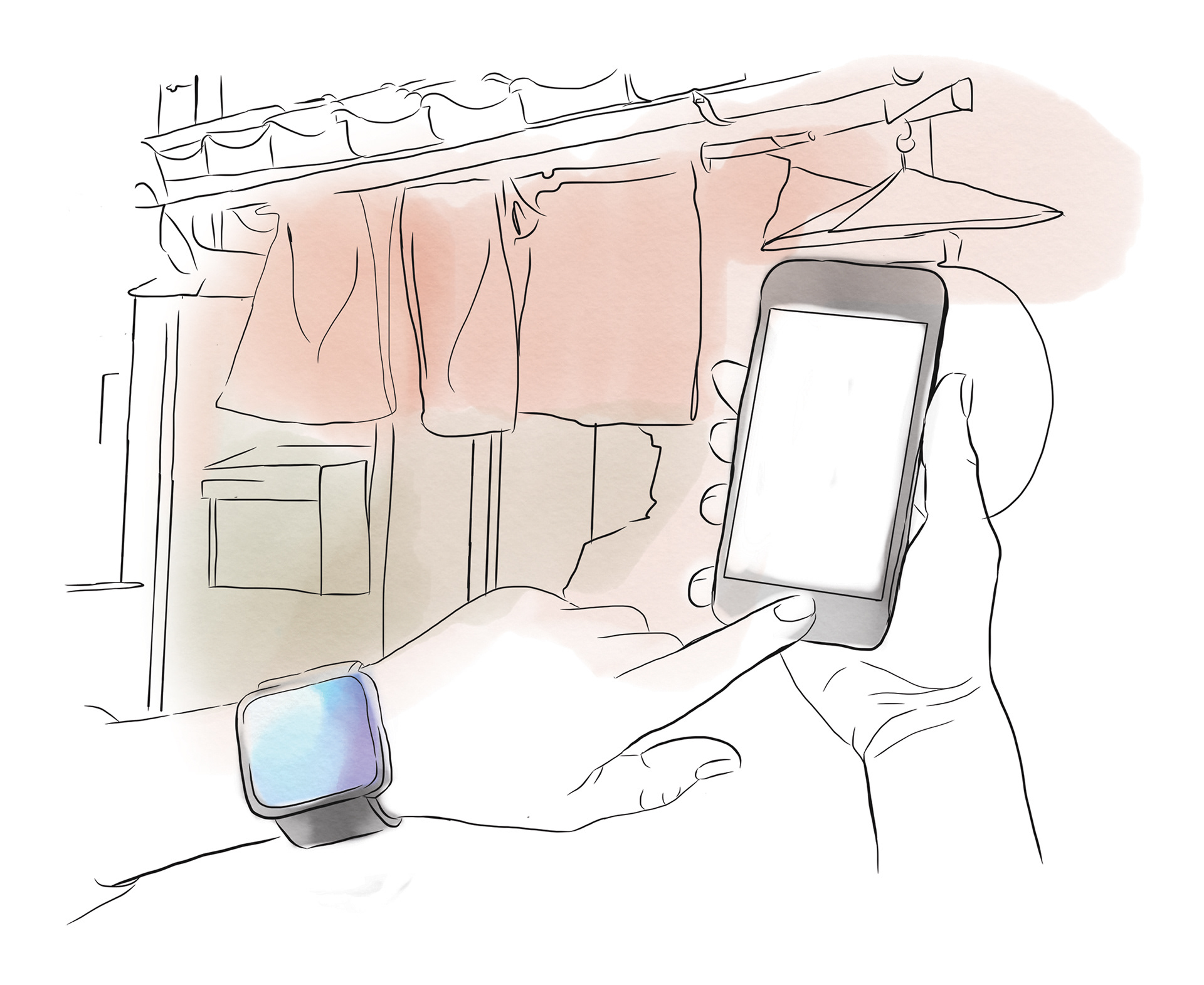
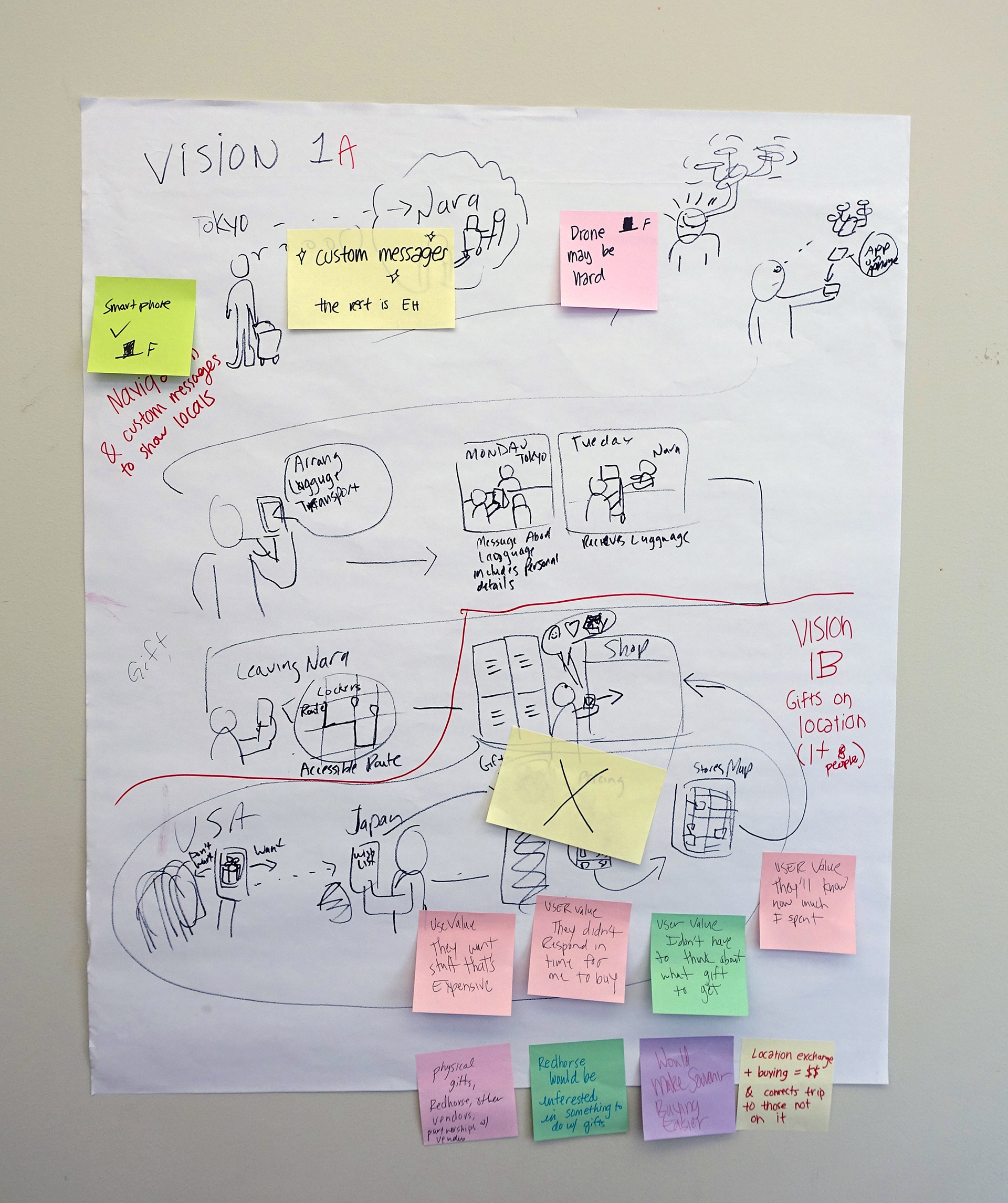
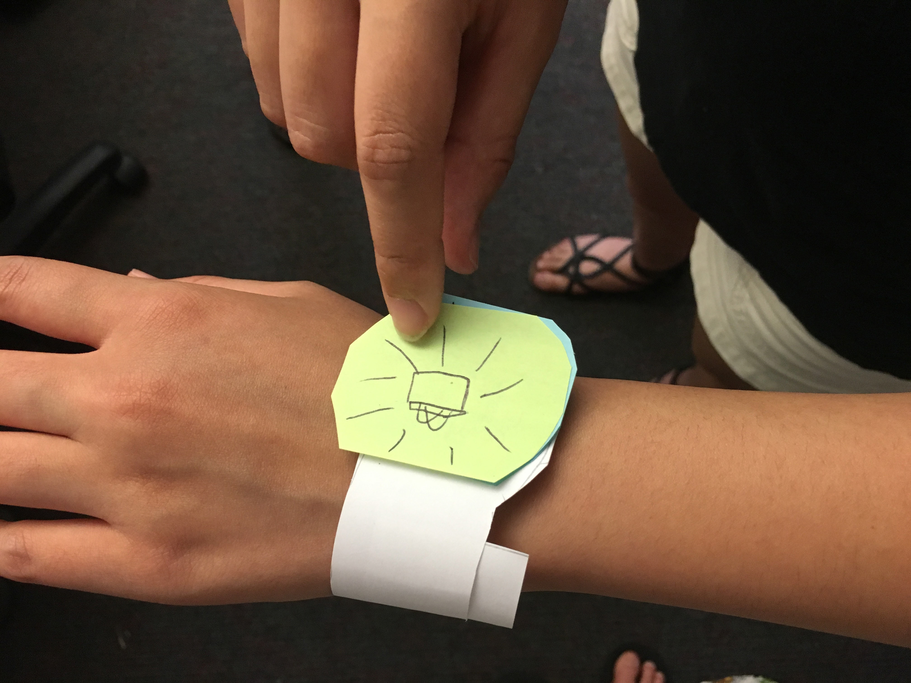
Notifications need to evolve and be delivered by ambient triggers through wearables or environmental peripherals.
We found that many users today loath mobile notifications especially when they are irrelevant to the user's context. We can alleviate the burden of mobile notification overload and deliver notifications via an ambient trigger. This trigger could be a smartwatch version of the Abeo app that notifies users when helpful information is available on their phones, allowing users to explore Japan freely without being glued to their phones.
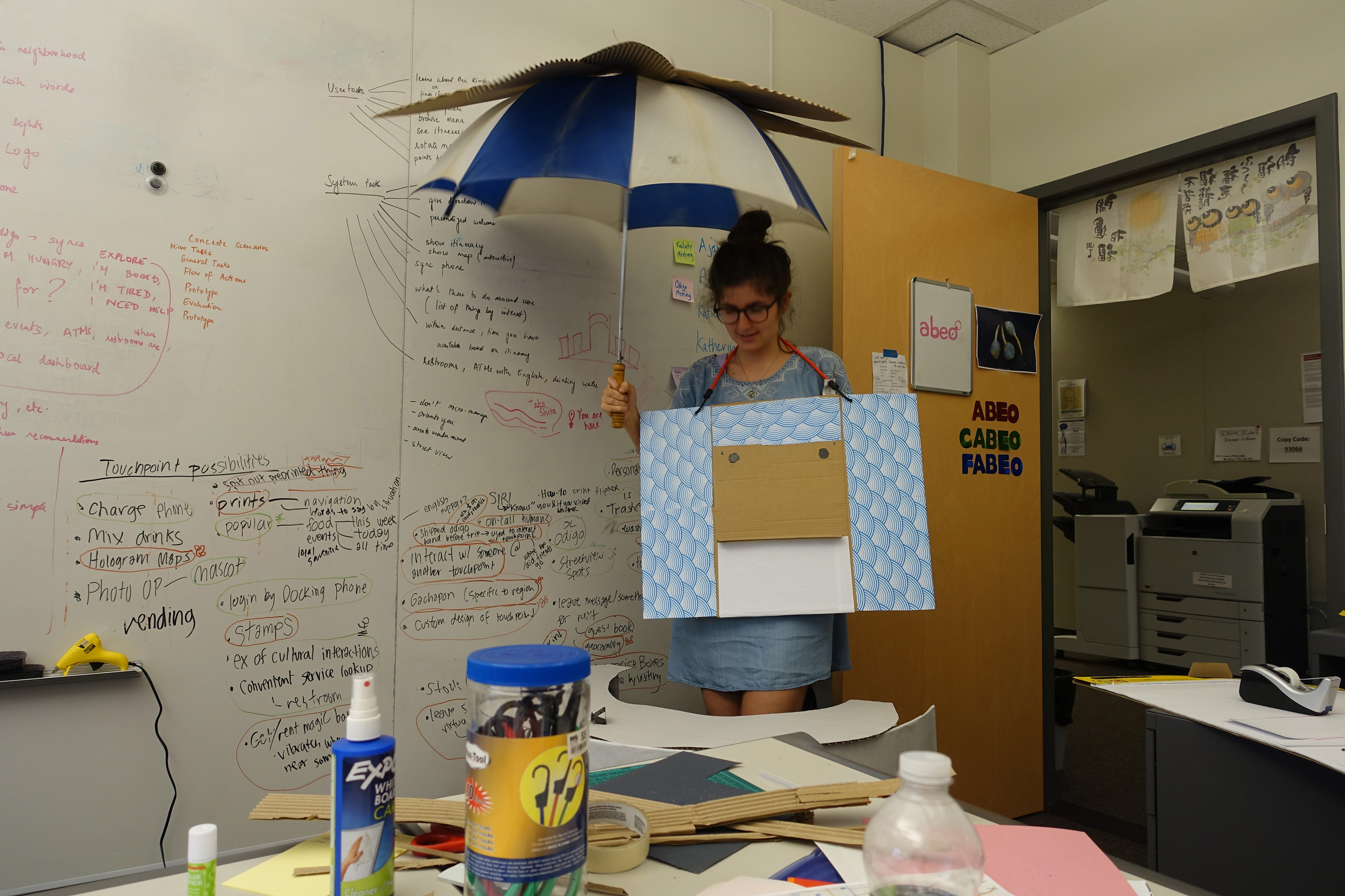
In the more distant future, the trigger could become a wearable device that provides ambient notifications by glowing or changing color. Other services and technologies could be embedded in a custom wearable to make it more valuable to users, such as transportation chips currently embedded in train pass cards or electronic hotel keys. The trigger could also be something in the environment that alerts users when they are near an Odigo spot. A technology-enabled lantern could also pair with a system that alerts Odigo spot owners and service workers when a foreign tourist is near or in the business so that someone who speaks English can greet the tourist at the door.
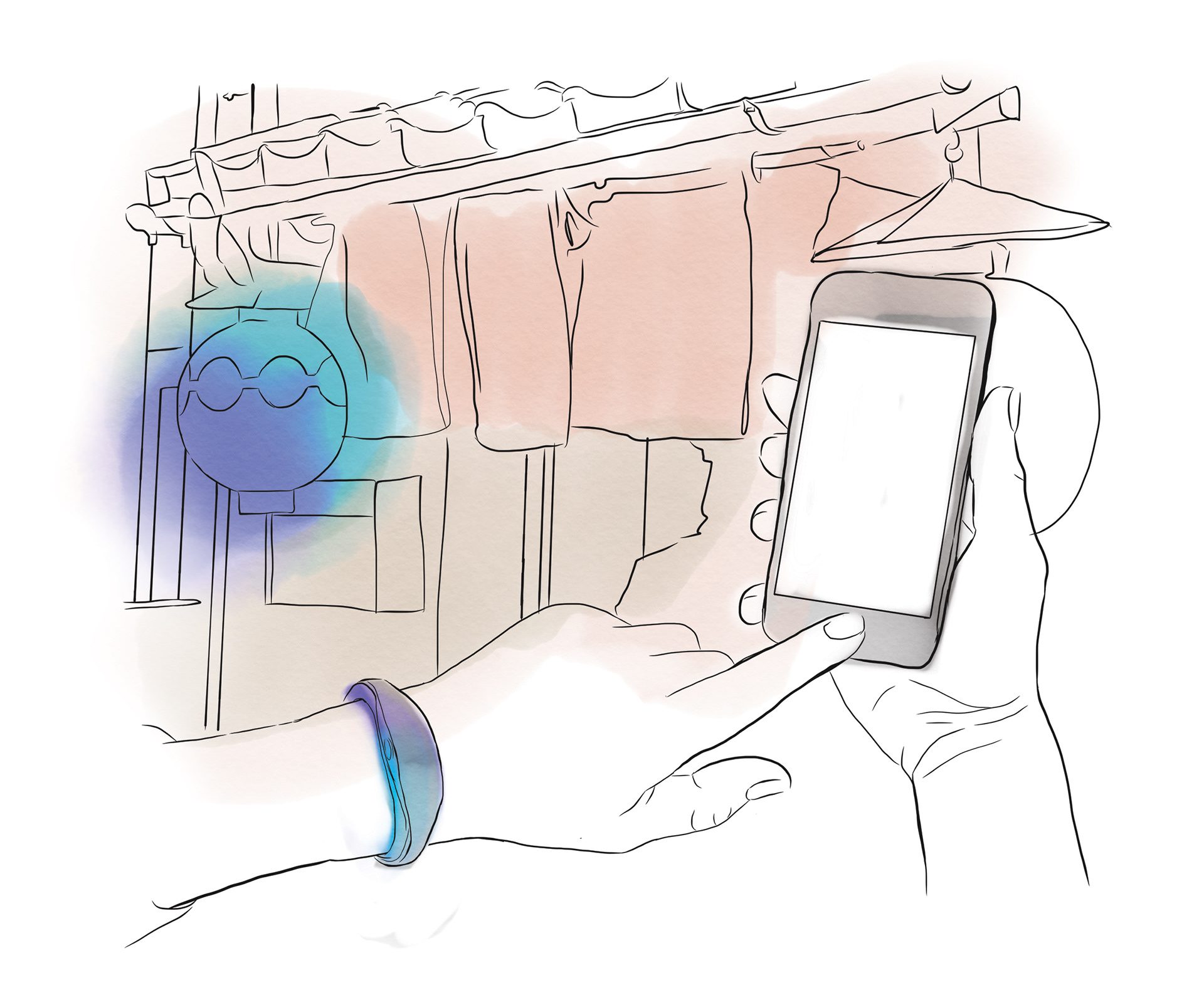
Sketches envisioning the future of notification triggers
Understanding tourists visiting Japan and the tourism market helped us identify opportunities.
To understand our target user we needed to dig down into their experience and understand their goals and pain points. A few of my teammates delved into researching tourism data to understand what different nationalities visit Japan and why, and they scraped social media to learn the types of activities tourists document and participate in. My involvement in this part of the research was conducting interviews with tourists who visited Japan, card sorting activities with frequent travelers, and ethnographic research.
English-speaking tourists want to participate in Japanese culture but are hesitant because of the cultural and language barriers.
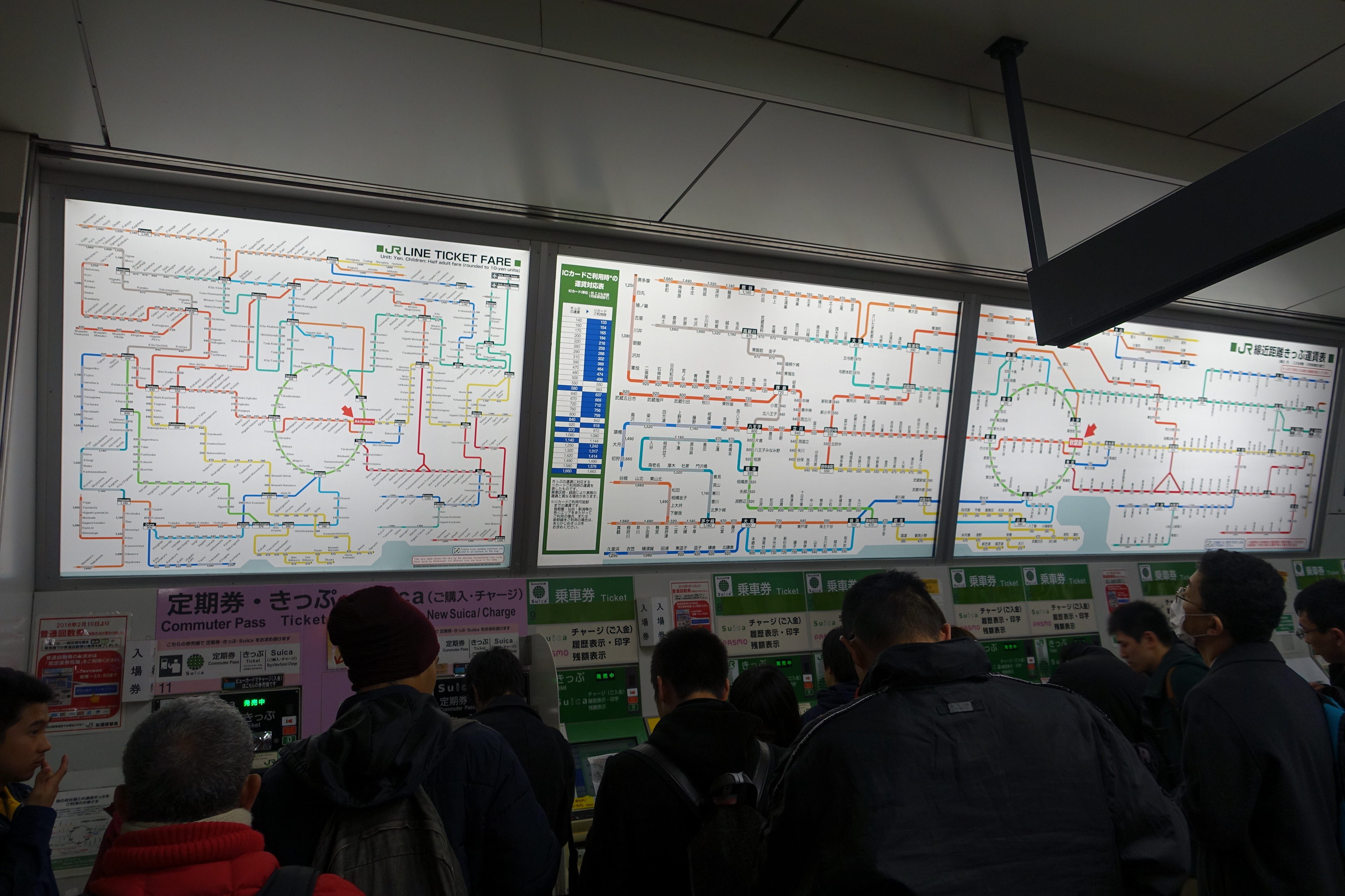
We started our interviews with individuals who had recently visited Japan. Our goal was to understand their overall experience. We asked questions focused on trip planning, navigating in the country, communication with the locals, and pain points. We also shared a survey with similar questions through social media. While in the country we interviewed any English-speaking tourists we could find. These interviews were shorter and focused on learning their plans while in the country and their pain points. From the interviews, we learned of three big pain points for English-speaking tourists: communication, cultural differences, and not having access to a data connection.
Tourists will avoid the areas that do not have a lot of English signage or speakers.
A scenario exercise taught us about what people expected while visiting Japan and how they would share their journey on social media. First, we presented them with scenarios that could happen to them, for example visiting a temple or getting lost, and asked them to describe how they would react. Then we showed them photos of different places and monuments in Japan and asked them if they would share it on social media and explain why or why not. We didn’t learn much from the social media part, but the scenario cards provided a lot of valuable insights. Two of the biggest insights; people will stick to areas where they think there is more English signage or English speakers are available, and that they want to visit Japan for the things it’s known for like traditional Japanese culture and food.
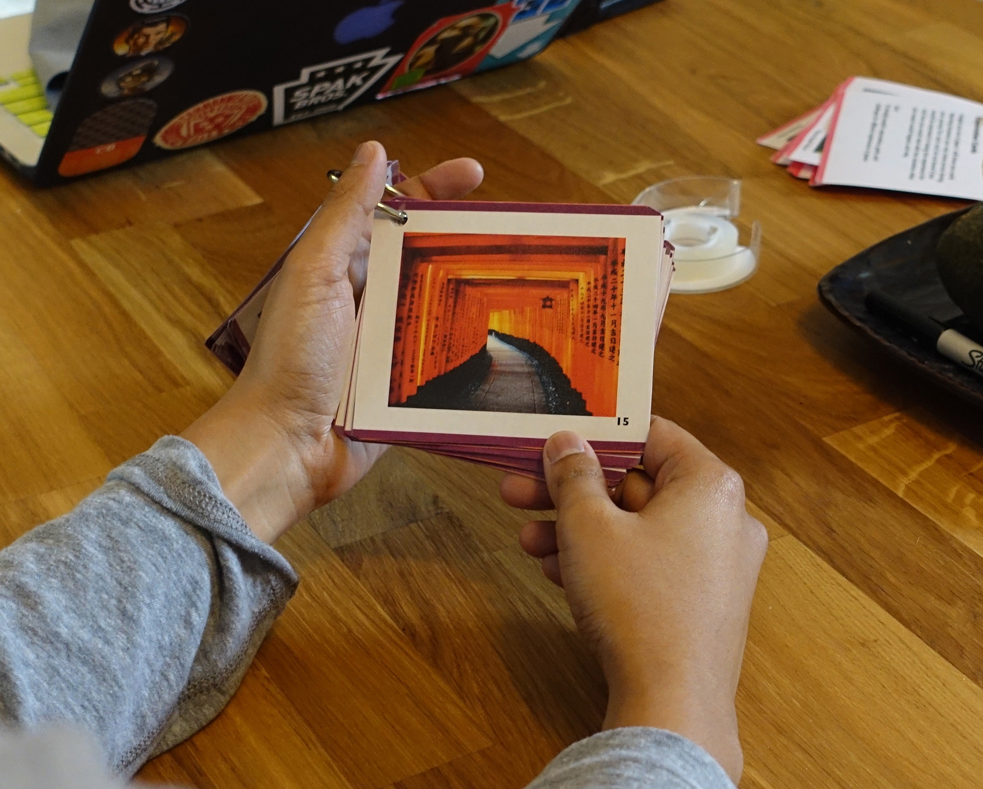
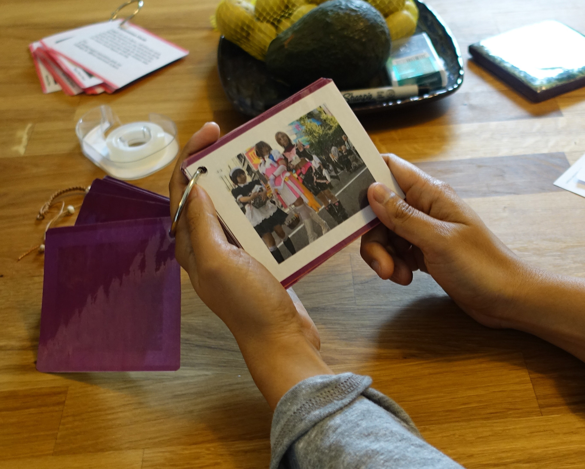
Cards from the scenario exercise we conducted.
We confirmed our research findings by visiting Japan.
A large part of our research into the English-speaker's journey in Japan was to live it ourselves. We spent a total of seven days immersed in the tourist experience. We visited three major cities and participated in as many tourist activities as possible. We took notes about our own experiences and the other tourists we observed, and also conducted interviews. The trip verified our findings from our research, and the trip gave us an intimate understanding of the English-speaking tourists’ in experience in Japan that the initial research could never provide.
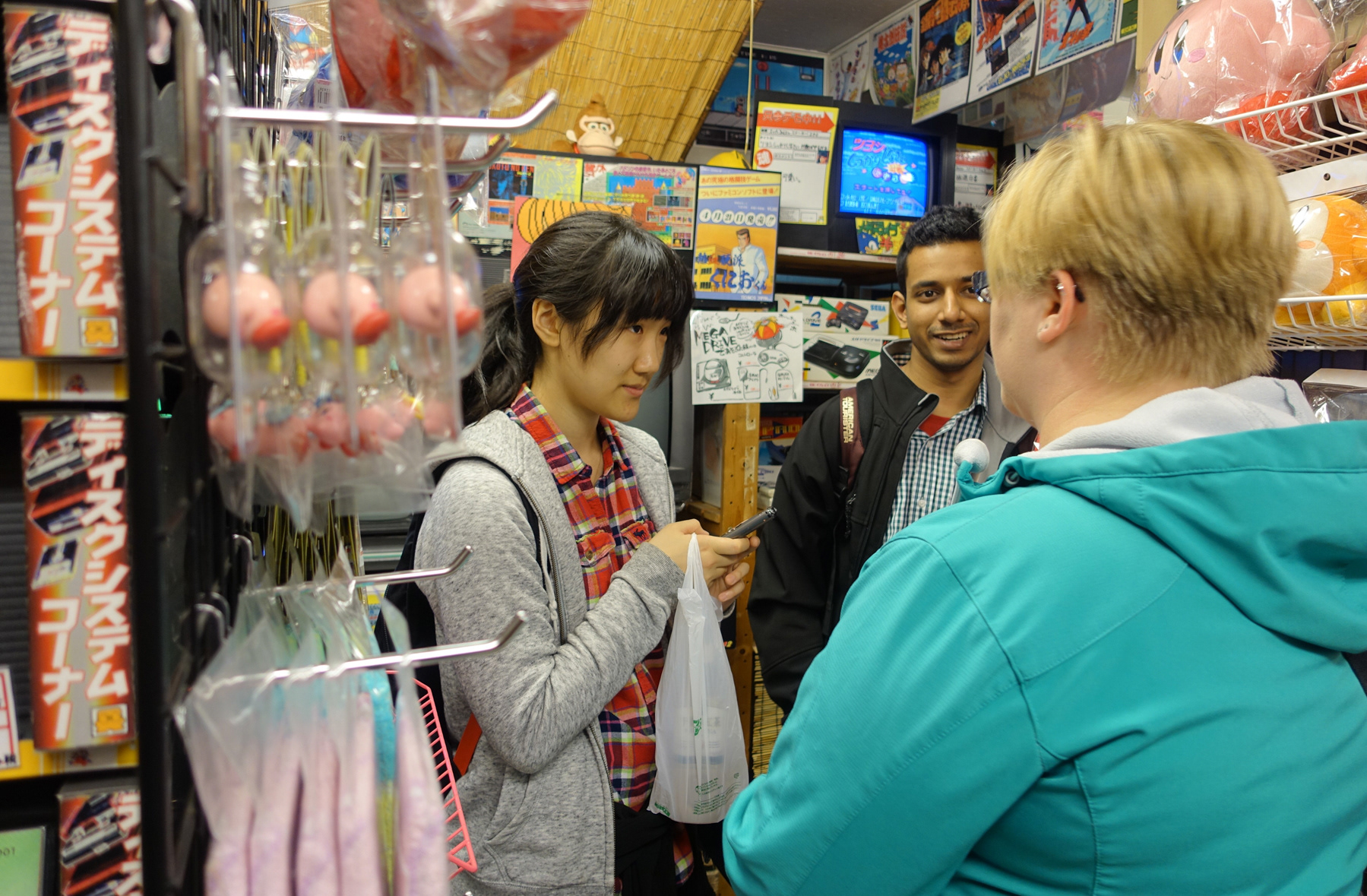
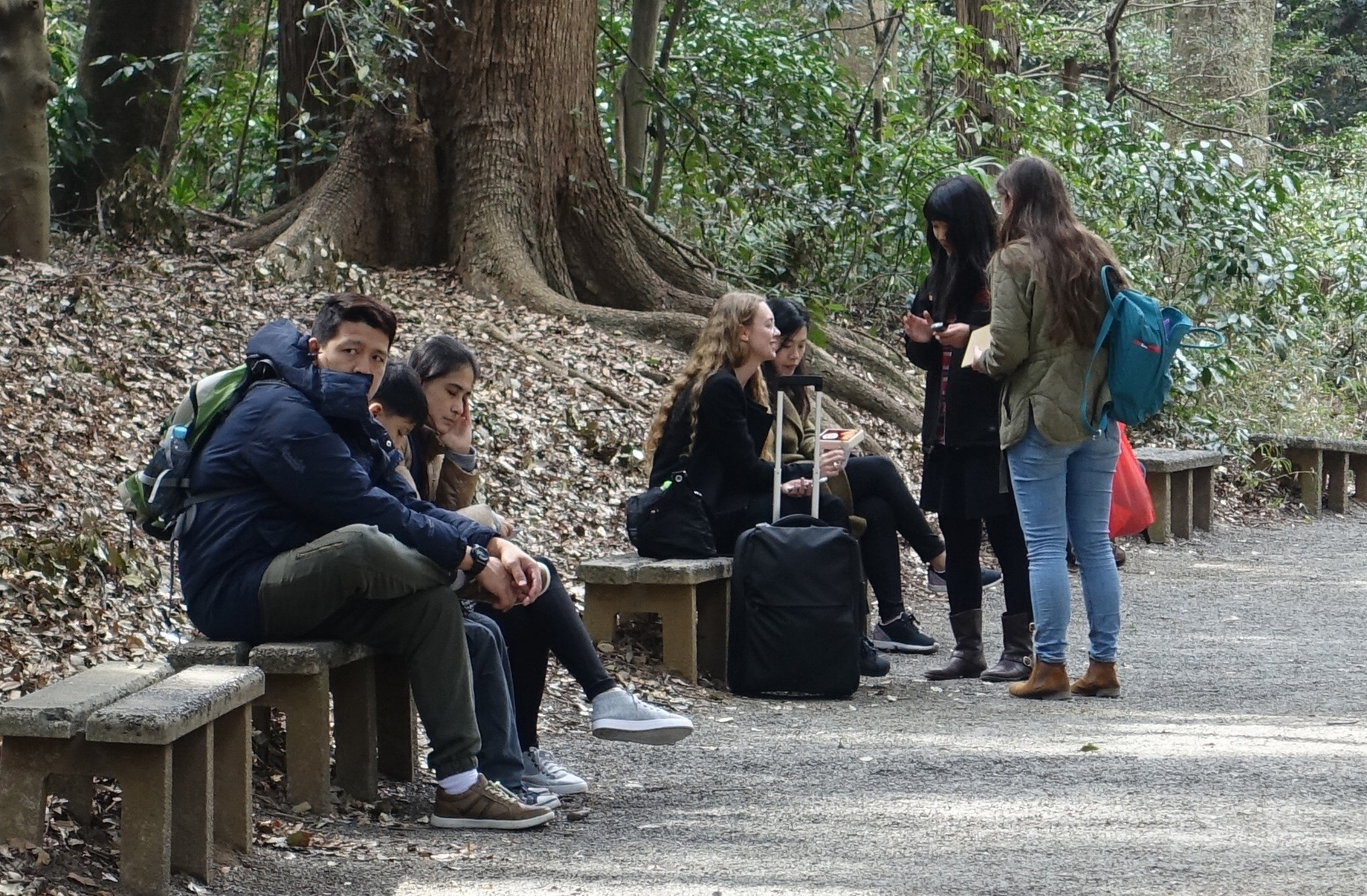
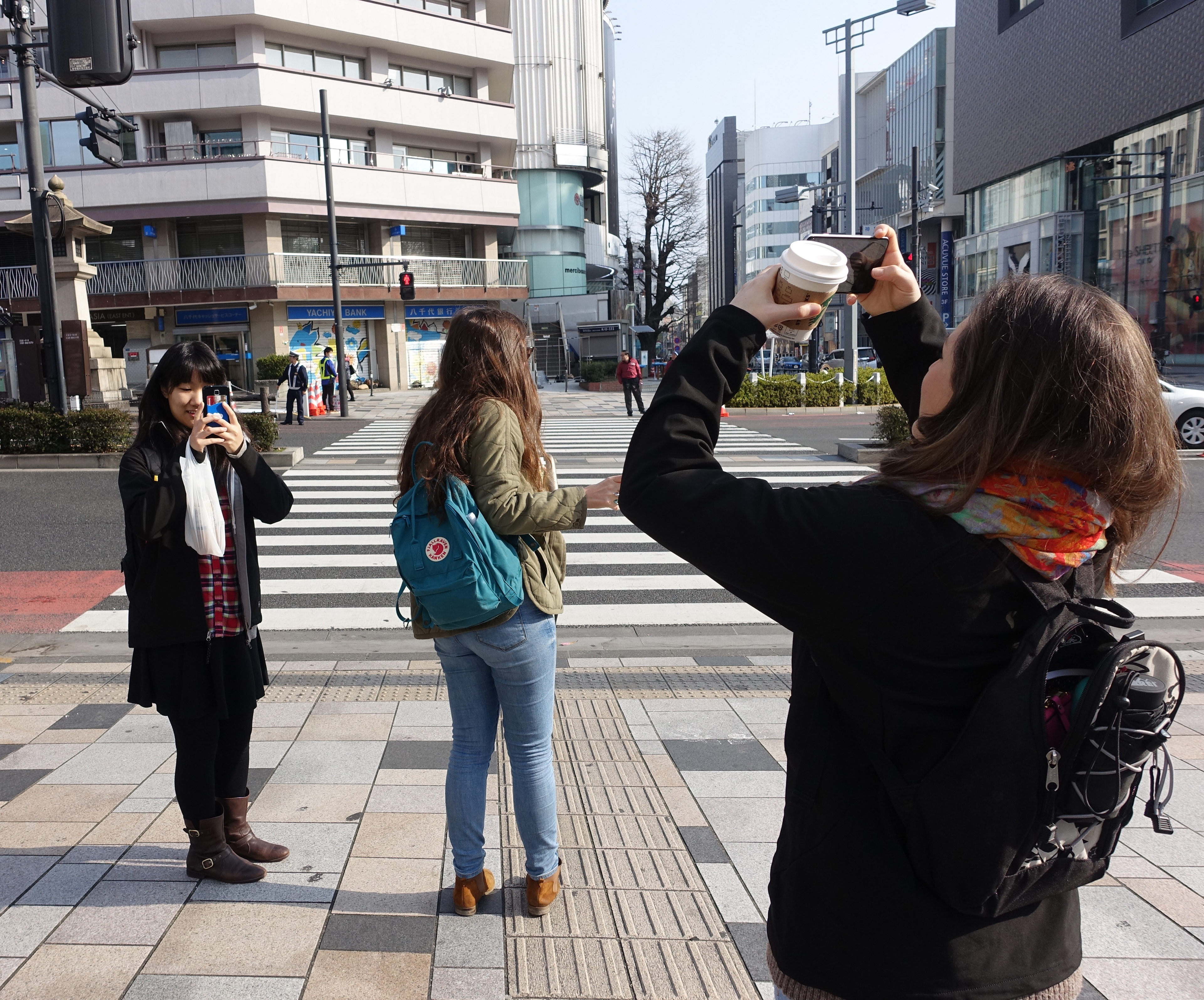
We conducted impromptu interviews with other English speakers we encountered during our trip.
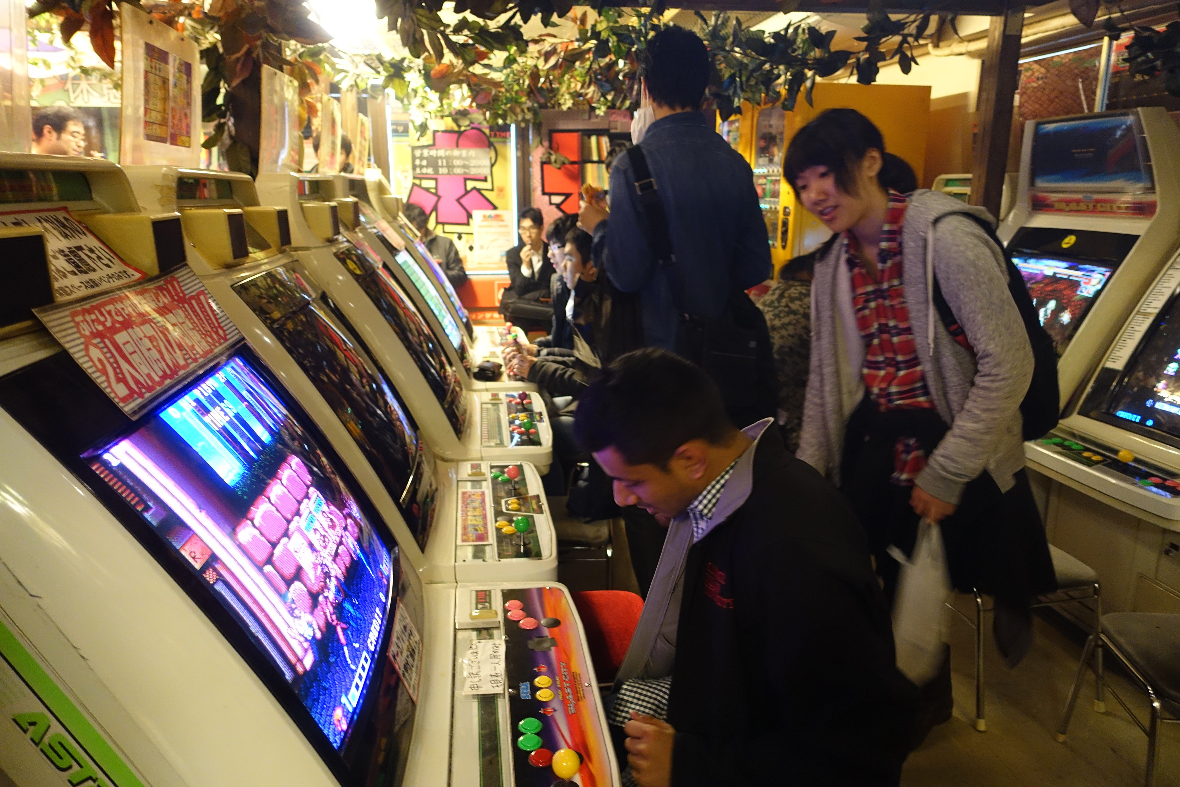
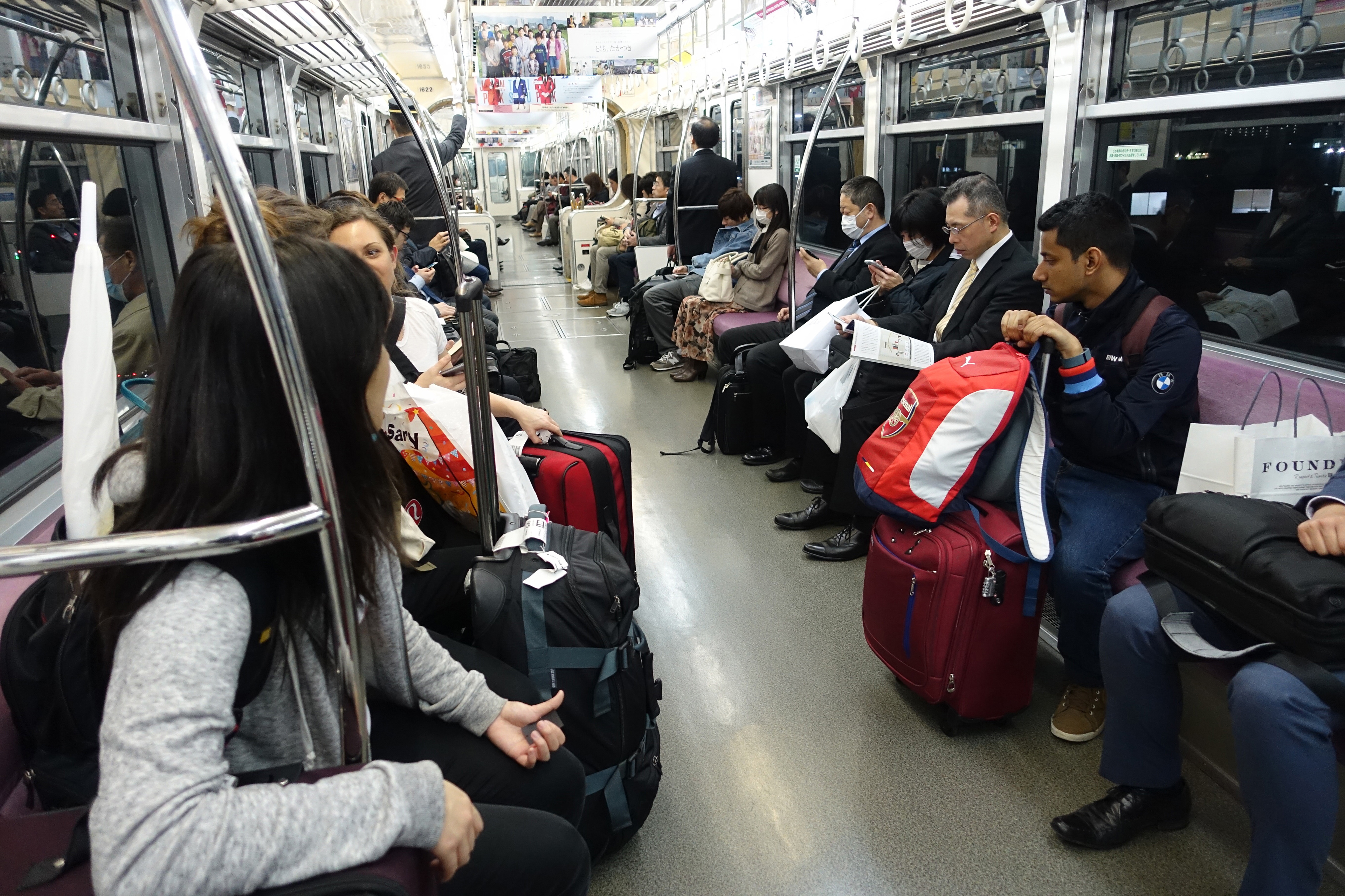
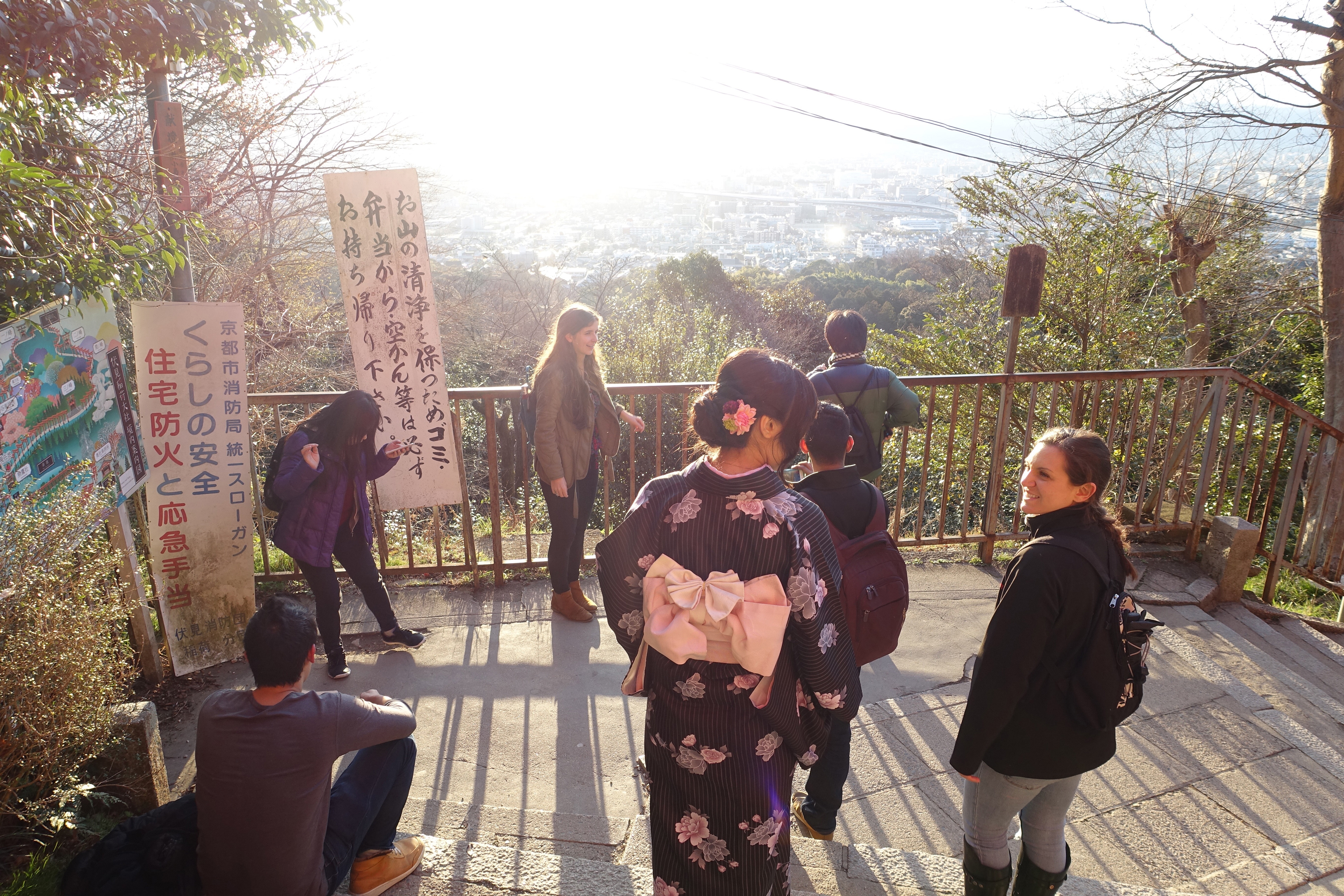
We spent a lot of the trip living the tourist experience firsthand.
Tourists misinterpret Japanese people as cold or uninterested.
To get an expert's perspective, a couple of our team members interviewed a professor of Japanese culture at Carnegie Mellon University. She described Japanese culture from a perspective different from that of foreign tourists. We learned that tourists often misinterpret Japanese mannerisms in negative ways due to a cultural and language barrier. People in Japan are not as open with their private information as English speaking cultures are out of fear of accidentally embarrassing themselves, and they try to keep interactions short to be respectful of others time. To people from English speaking countries, this is often misinterpreted as being uninterested, distant, or rude, which prevents them from asking for help in some instances. In reality, these mannerisms are a result of them being extremely polite, and Japanese will go out of their way to help someone if asked.
The tourism market is extremely competitive, but the services are limited once you are in Japan.
We studied Odigo’s competitors from TripAdvisor to Lonely Planet and developed a competitive analysis. All the services are ideal for planning trips, but they only provide reviews of places. Lonely Planet was the only one to offer any cultural tips, but we found them lacking when trying to use them in Japan. The best tips we got were from an Odigo blog post and the interview with the professor of Japanese culture. Through our review and use of the services for our trip, we identified that in country help with cultural tips as a huge opportunity area for Odigo.
Information design for public spaces needs to stand out to be effective.
We interviewed experts in theme park and museum exhibit design to understand the methodologies, goals, and concerns of those developing interactive and educational experiences in public places. We learned that to communicate relevant information in public spaces you need to draw people's attention to it. We visited the Carnegie Science Center and the Children’s Museum in Pittsburgh to see first hand.
Odigo’s real goal was to expand their user base.
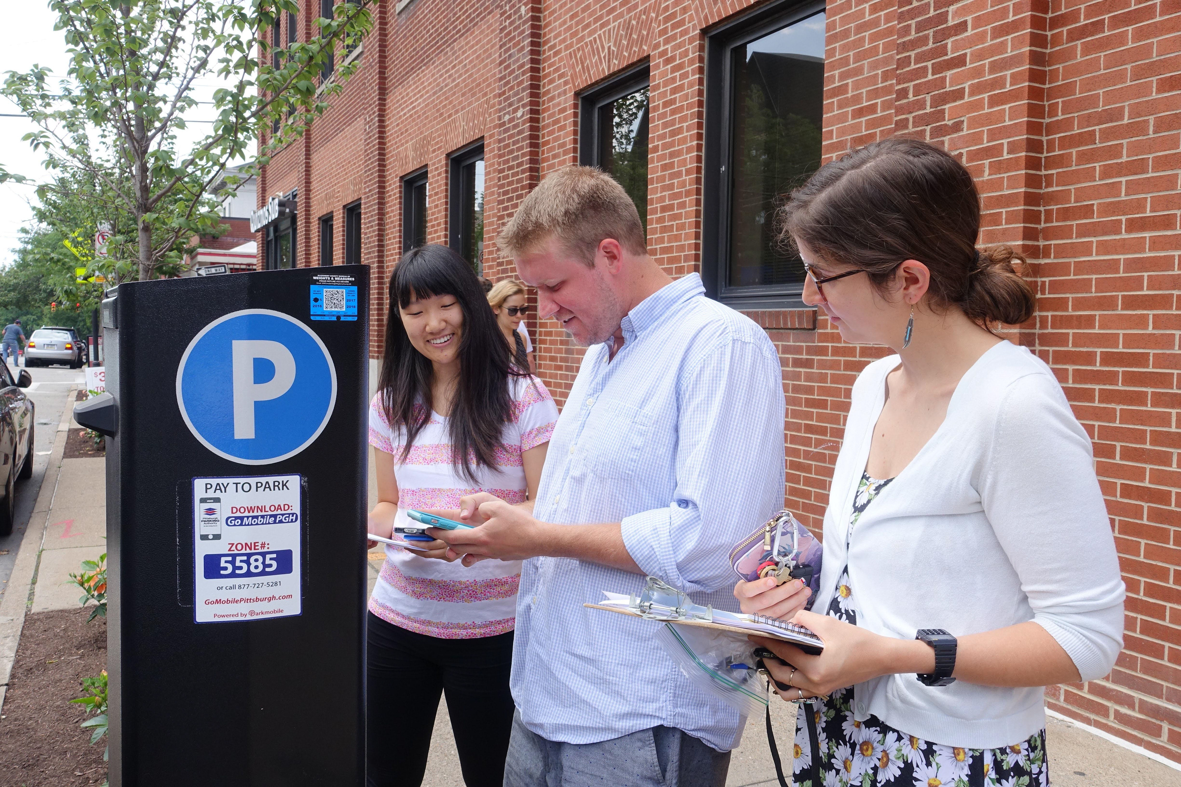
Odigo came to us with only one direction, that it should be something like a kiosk, and didn’t give a lot of insight as to why. Except for the fact they had locations, they knew it could be piloted at. We needed to have a better understanding of what their motivation for the kiosk was and understand any potential ideas they had. We facilitated two co-design workshops with Odigo employees, one in Pittsburgh and one in Japan and conducted interviews with the majority of their employees.
The workshops offered us insight into the different ideas they were envisioning. For the most part, their ideas were large scale multi-media interactive experiences but focused on creating something fun for locals instead of something useful for English-speaking tourists. The interviews provided us with insight into their needs, values, and knowledge. From which we learned that the most important thing was the need to grow Odigo’s user-base. This information helped us pivot away from the idea of a kiosk and focus on a solution that made sense for their target users.
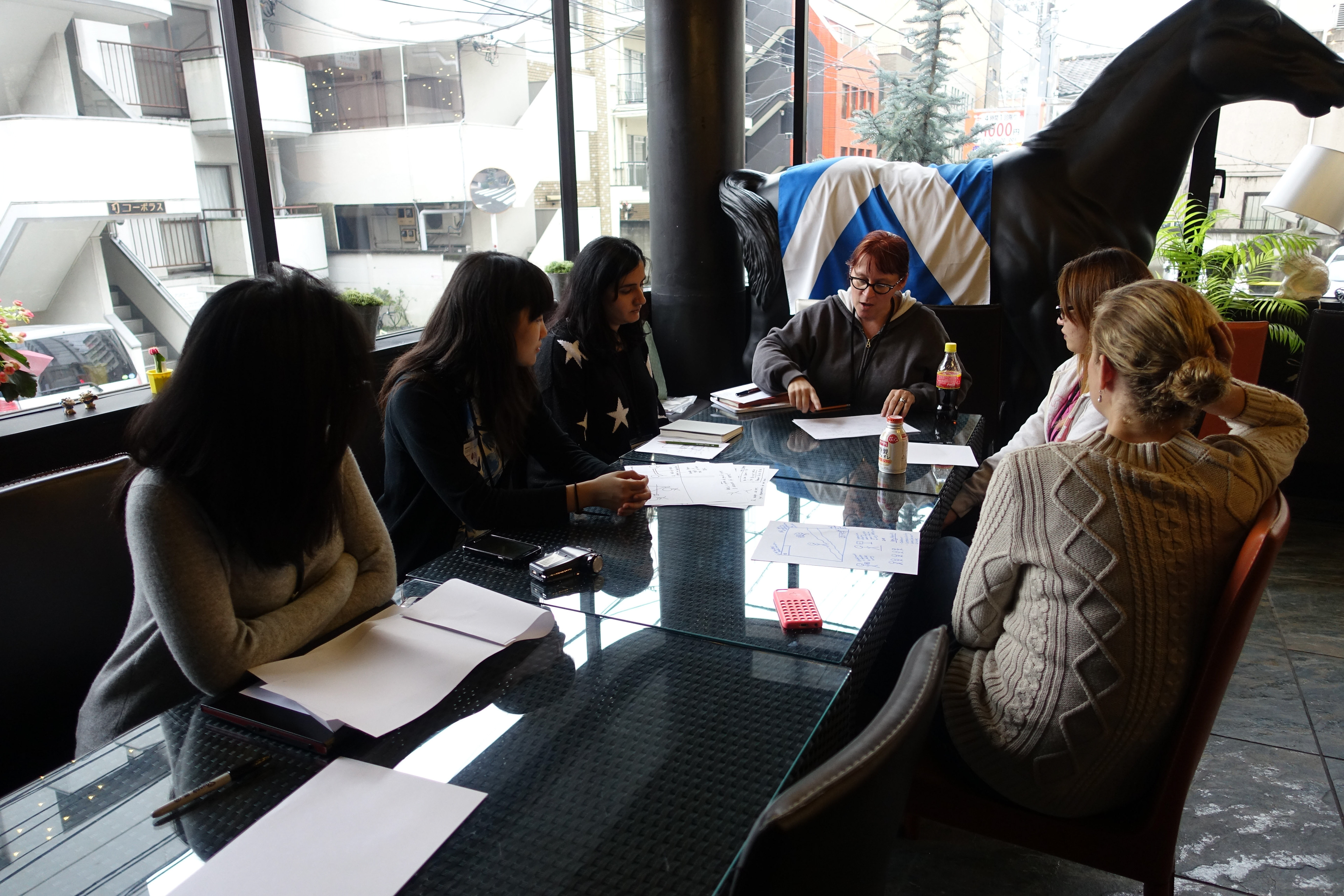
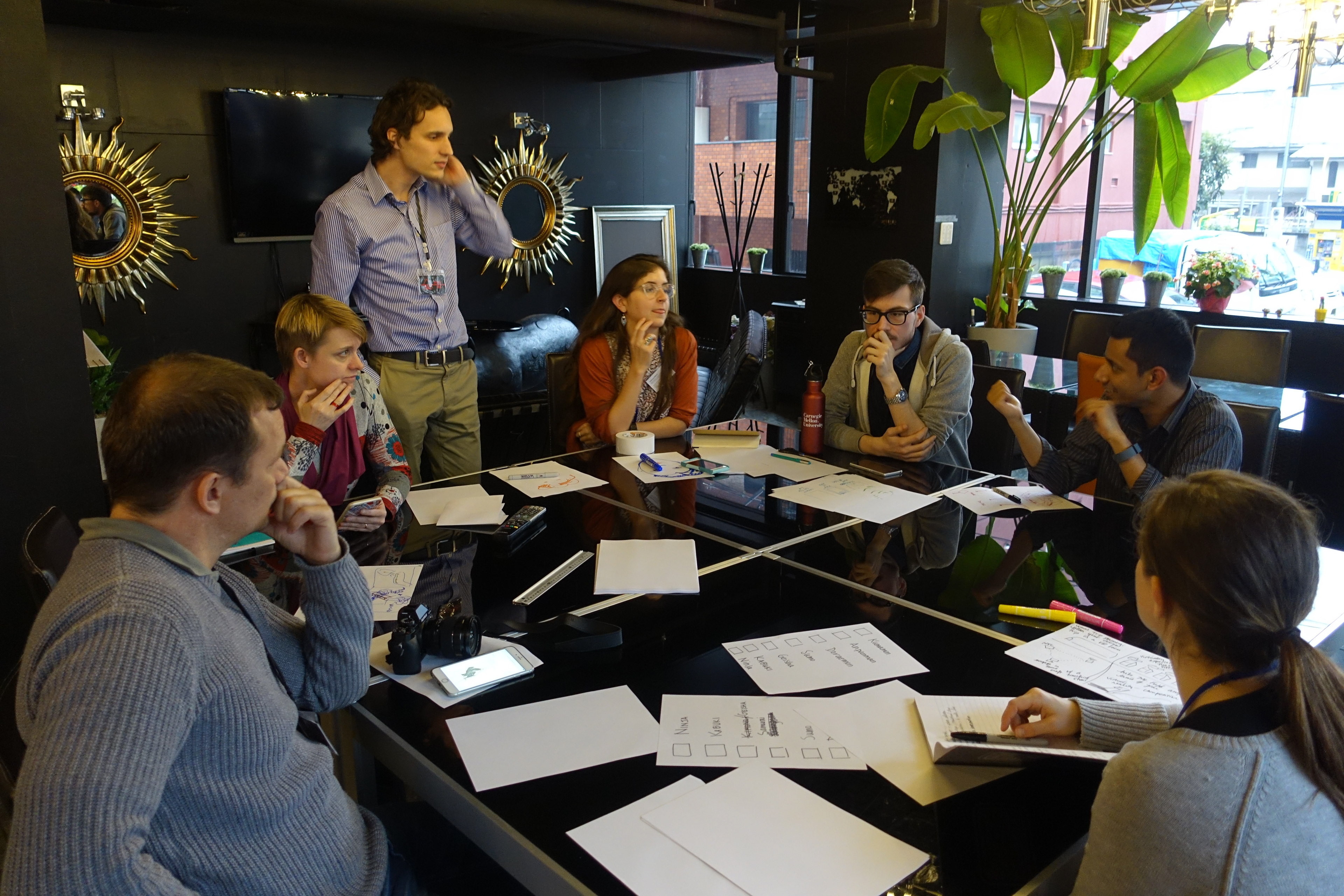
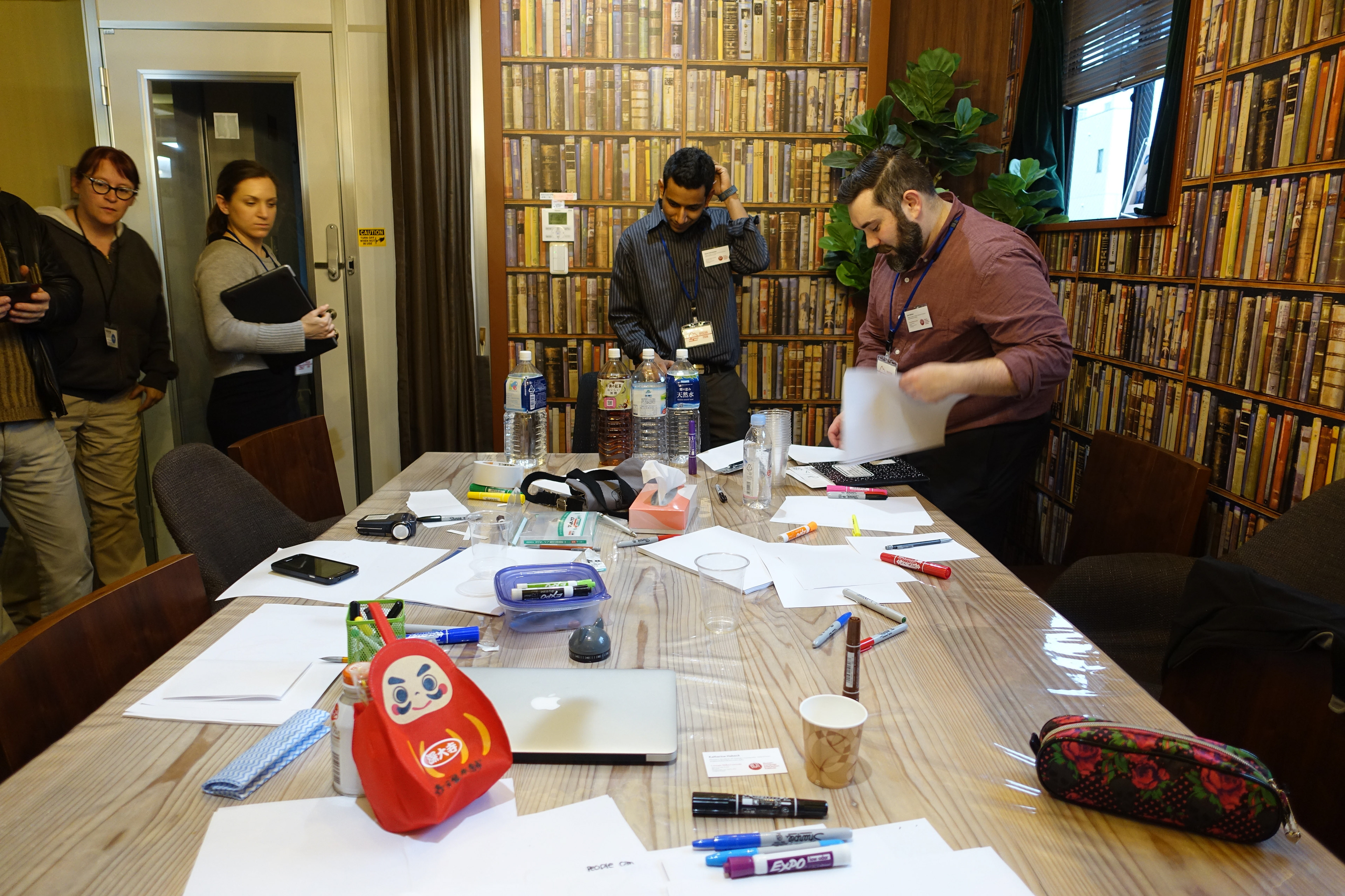
We conducted interviews and workshops at Odigo's office.
Our research was distilled down into four insights
We took all the data we had gathered from our interviews, observations, and experiences and turned them into users stories and affinity diagramed them. Through the affinity diagram, we identified themes and discovered relationships buried within the data. It also made it clear that the English-speaking Western Tourist's journey provided the best opportunities for Odigo. We distilled what we learned from the affinity diagram into four key insights and identified opportunity areas for each.
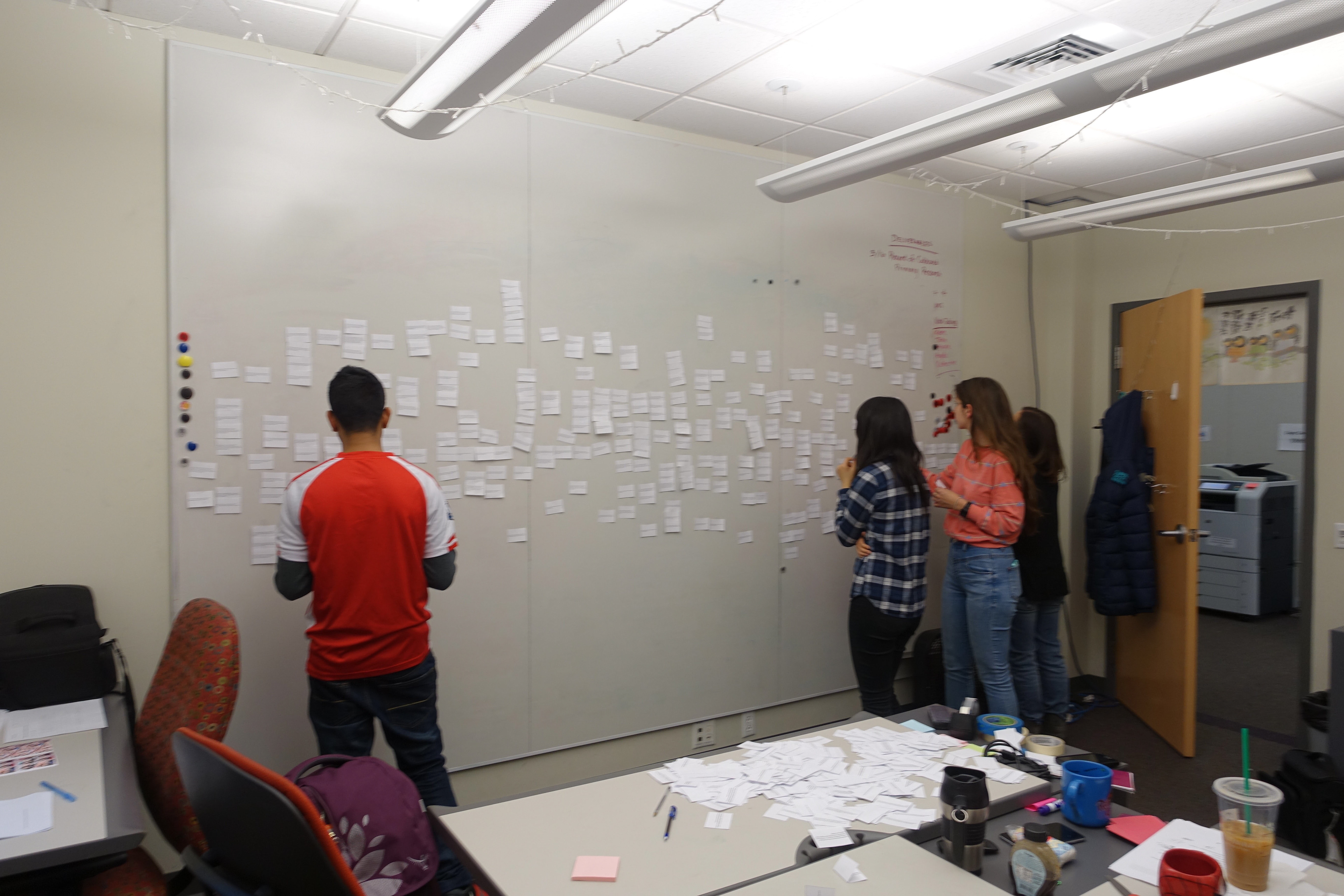
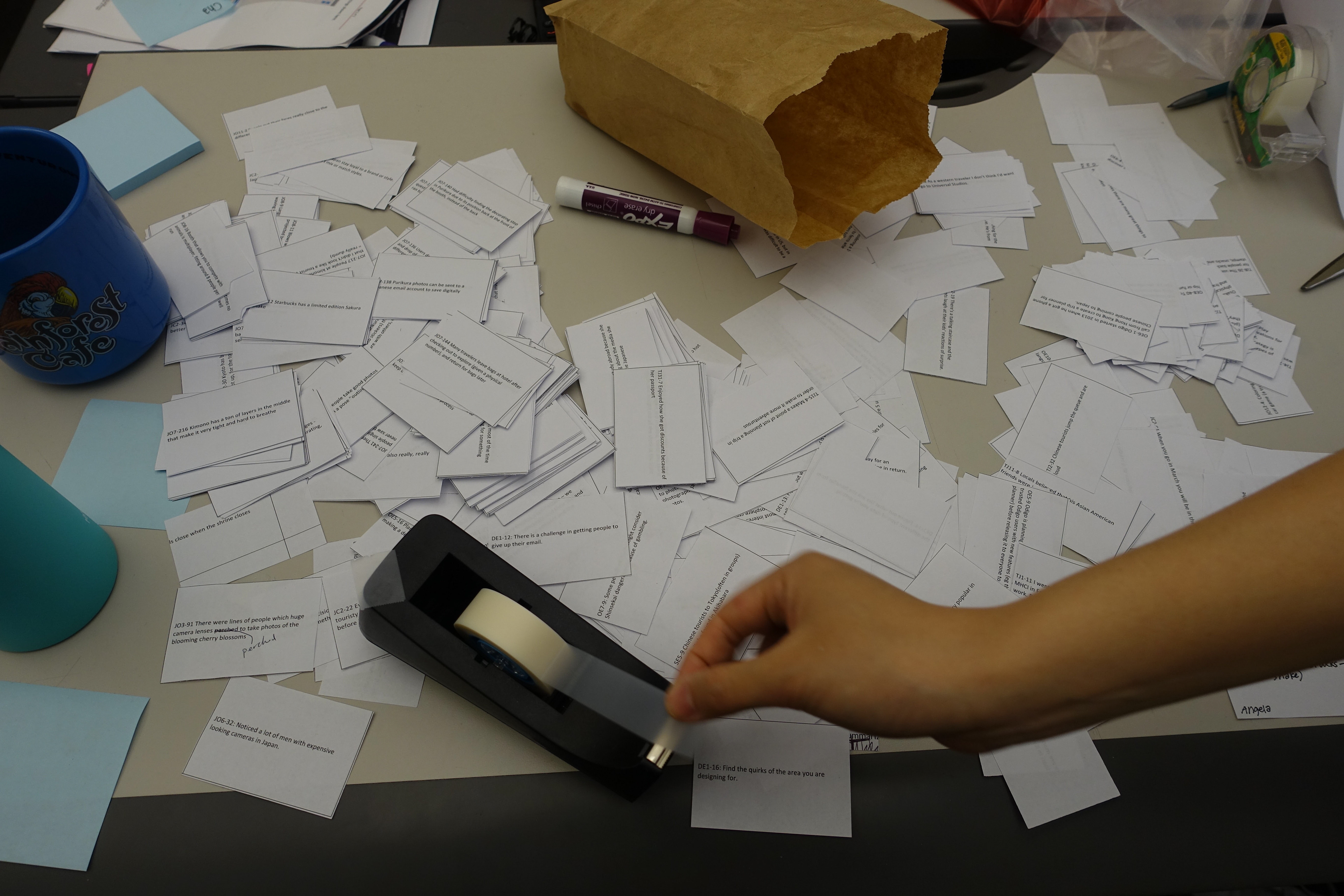
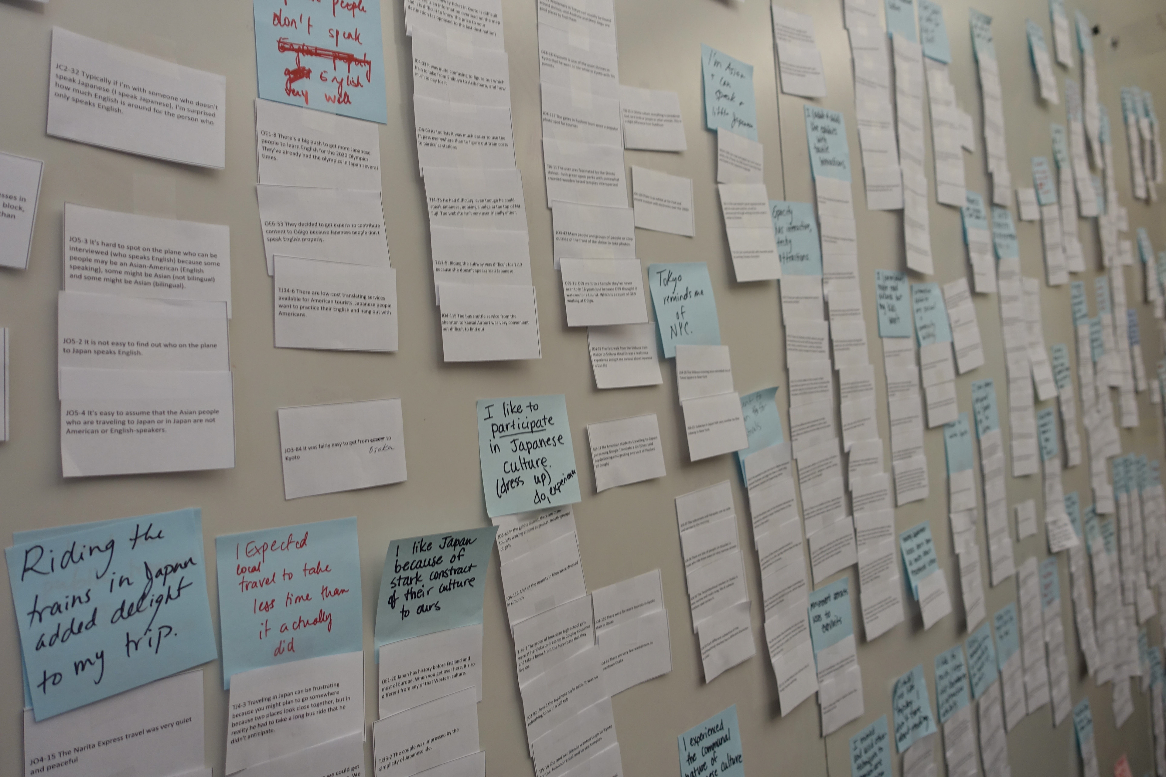
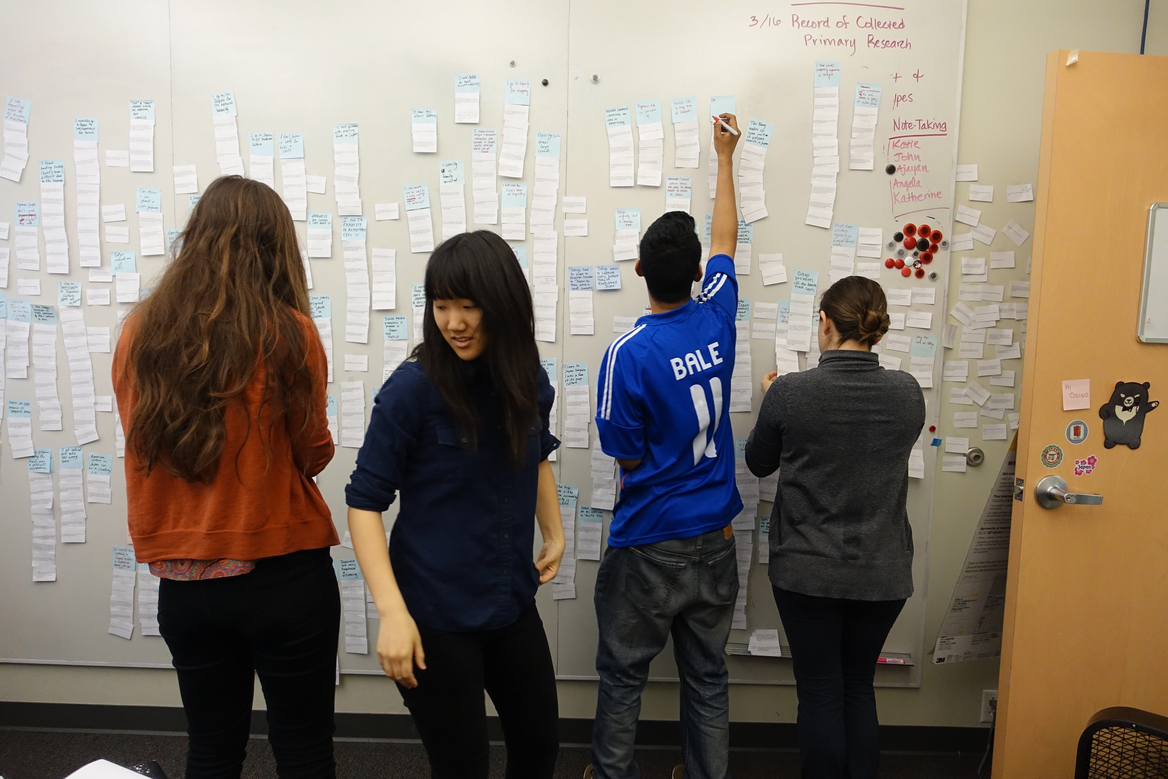
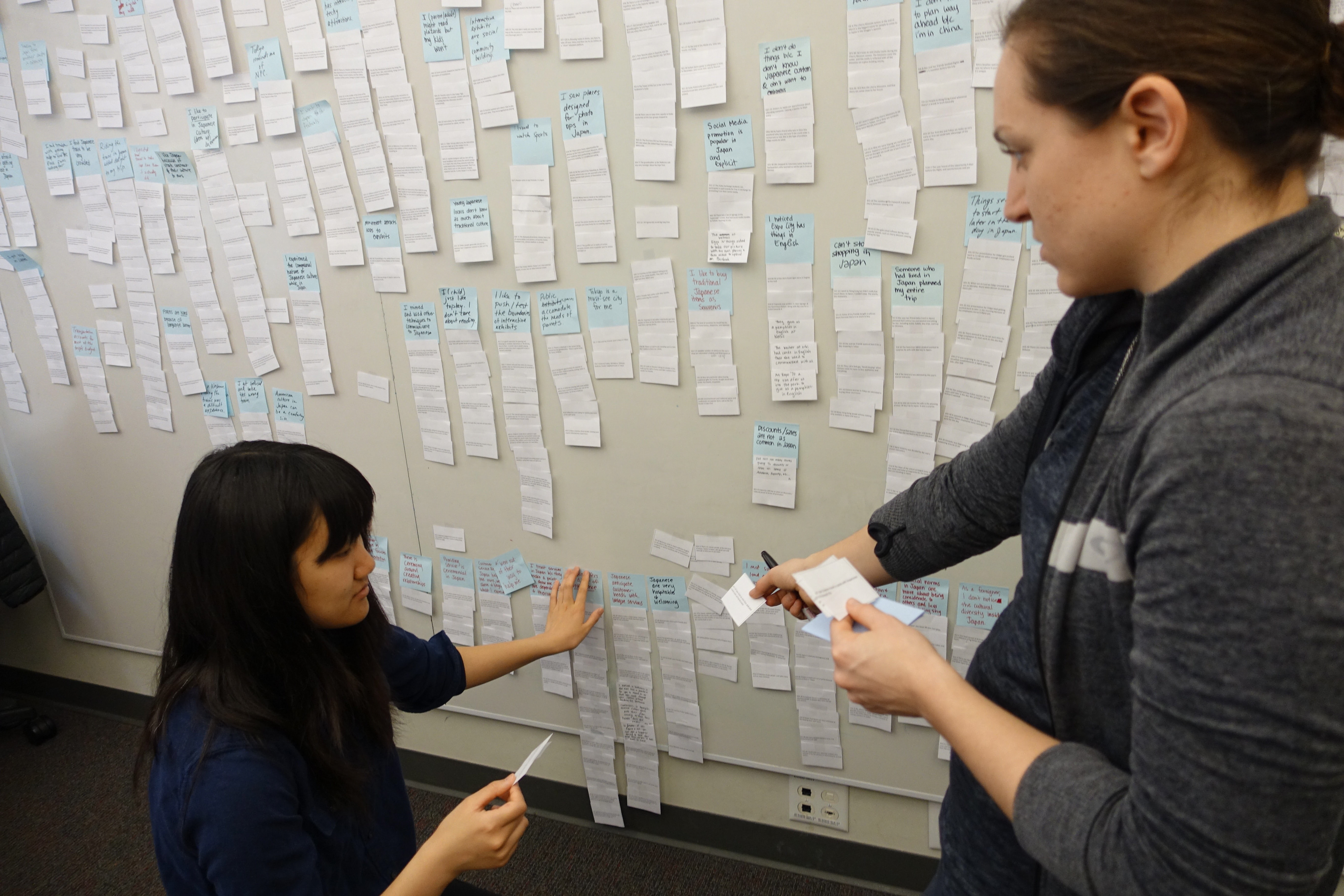
We affinity diagramed data from our interviews, observations & experiences and distilled them down into key insights.
Insight One
For Westerners, a trip to Japan is high stakes. Tourists often have a safety net in place before they visit such as a personal connection, cultural familiarity, or knowledge of the language.
For Westerners, a trip to Japan is high stakes. Tourists often have a safety net in place before they visit such as a personal connection, cultural familiarity, or knowledge of the language.
Opportunity
Create connections that help tourists travel to and within Japan
Create connections that help tourists travel to and within Japan
Insight Two
Tourists visit Japan for its unique culture and value participating in quintessentially Japanese experiences.
Tourists visit Japan for its unique culture and value participating in quintessentially Japanese experiences.
Opportunity
Develop experiences that support tourists’ desire to participate in Japanese cultural activities
Develop experiences that support tourists’ desire to participate in Japanese cultural activities
Insight Three
The cultural barrier inhibits the foreign tourist’s participation. Fear of embarrassment drives them to seek familiar surroundings.
The cultural barrier inhibits the foreign tourist’s participation. Fear of embarrassment drives them to seek familiar surroundings.
Opportunity
Give aid in situations where tourists are confused by social norms in Japan
Give aid in situations where tourists are confused by social norms in Japan
Insight Four
The language barrier makes routine tasks like navigating or ordering food extremely difficult for tourists.
The language barrier makes routine tasks like navigating or ordering food extremely difficult for tourists.
Opportunity
Give tourists a resource to navigate the language barrier beyond just pure translation
Give tourists a resource to navigate the language barrier beyond just pure translation
We wrapped up our research with the Spring presentation and booklet.
We used our Spring presentation and booklet, both requirements of the Capstone Project, to show Odigo the data supporting our insights. The booklet lays out our research findings, how we got there, and explains the opportunities we identified. The presentation was a summary of what was in the booklet with the addition of some anecdotes from people we interviewed and our own experiences.
I was the designer for the booklet and occasional editor. The rest of the team worked on creating separate bits of content, including models, illustrations, and copy, and I had to tie it all together in the booklet. The team was a big help providing useful feedback as I developed the overall style of the book.
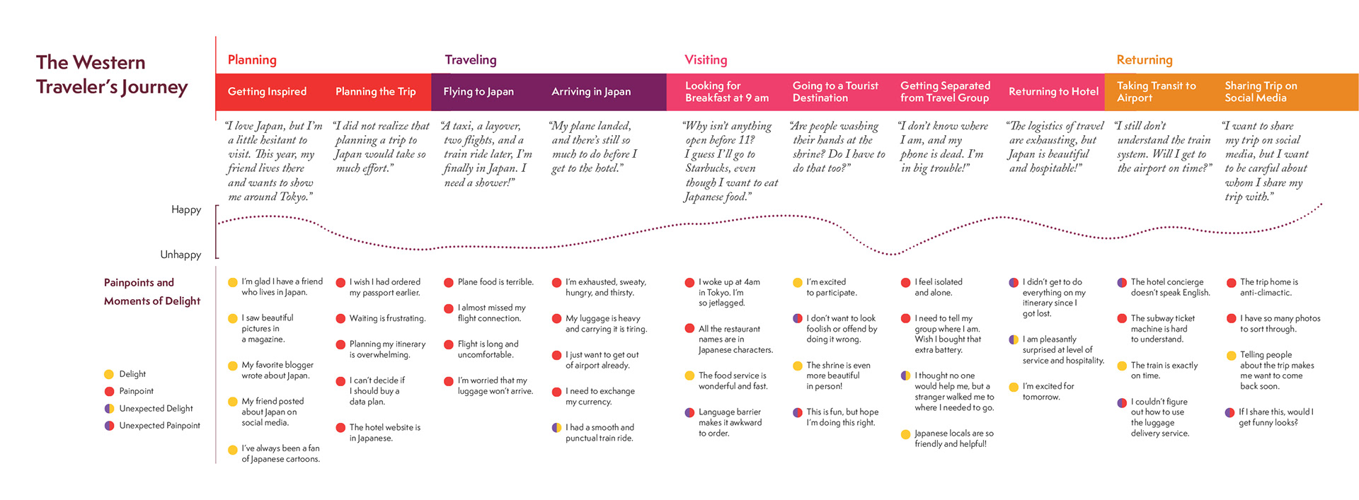
The Western Traveler's Journey Map, from the Spring Booklet, provided Odigo with an in-depth look at what a Western Tourist experiences during a visit to Japan from planning to returning home.
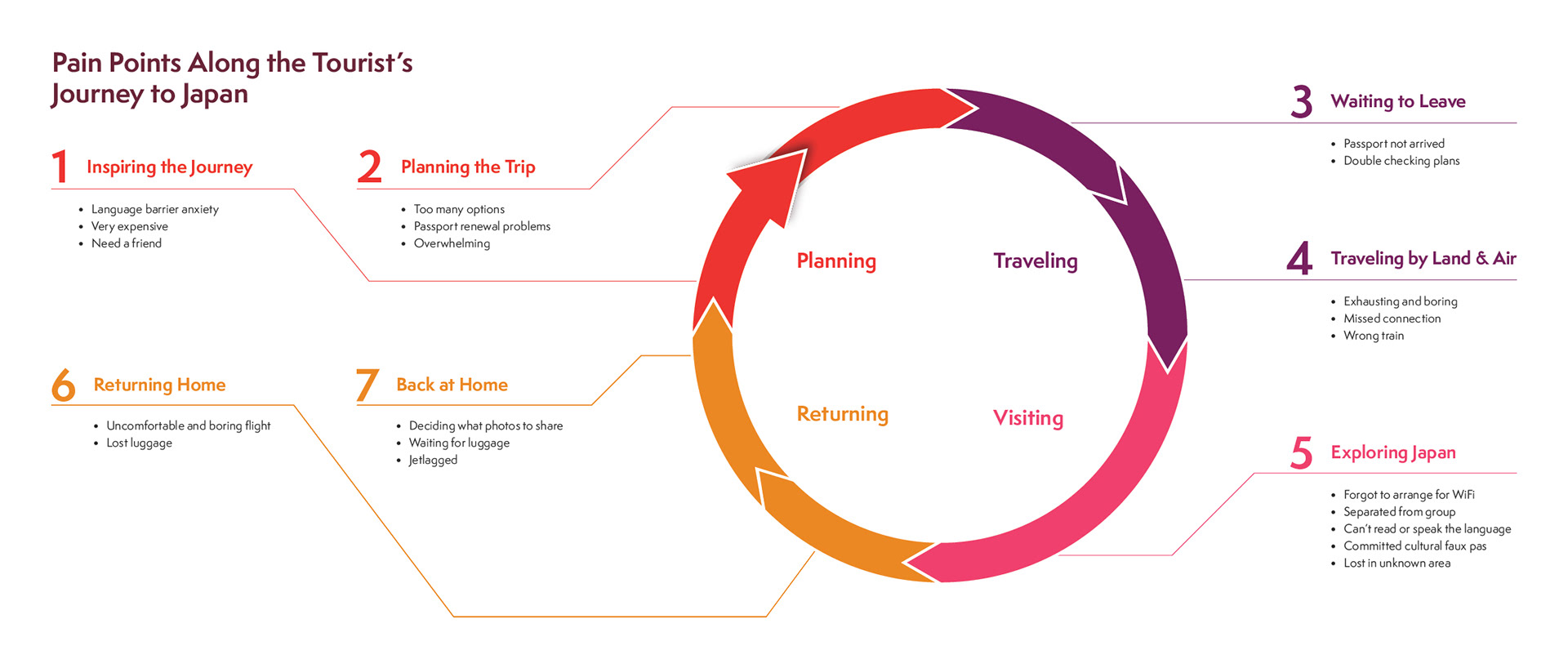
This model of pain points experienced by the Western Tourist, from the Spring Booklet, provided Odigo with all the hurdles Western Tourists face during a visit to Japan from planning to returning home.
Iteratively prototyping enabled us to continue our exploration of tourist expectations.
People want help, but they don’t want always be looking at their phone and are worried about their privacy.
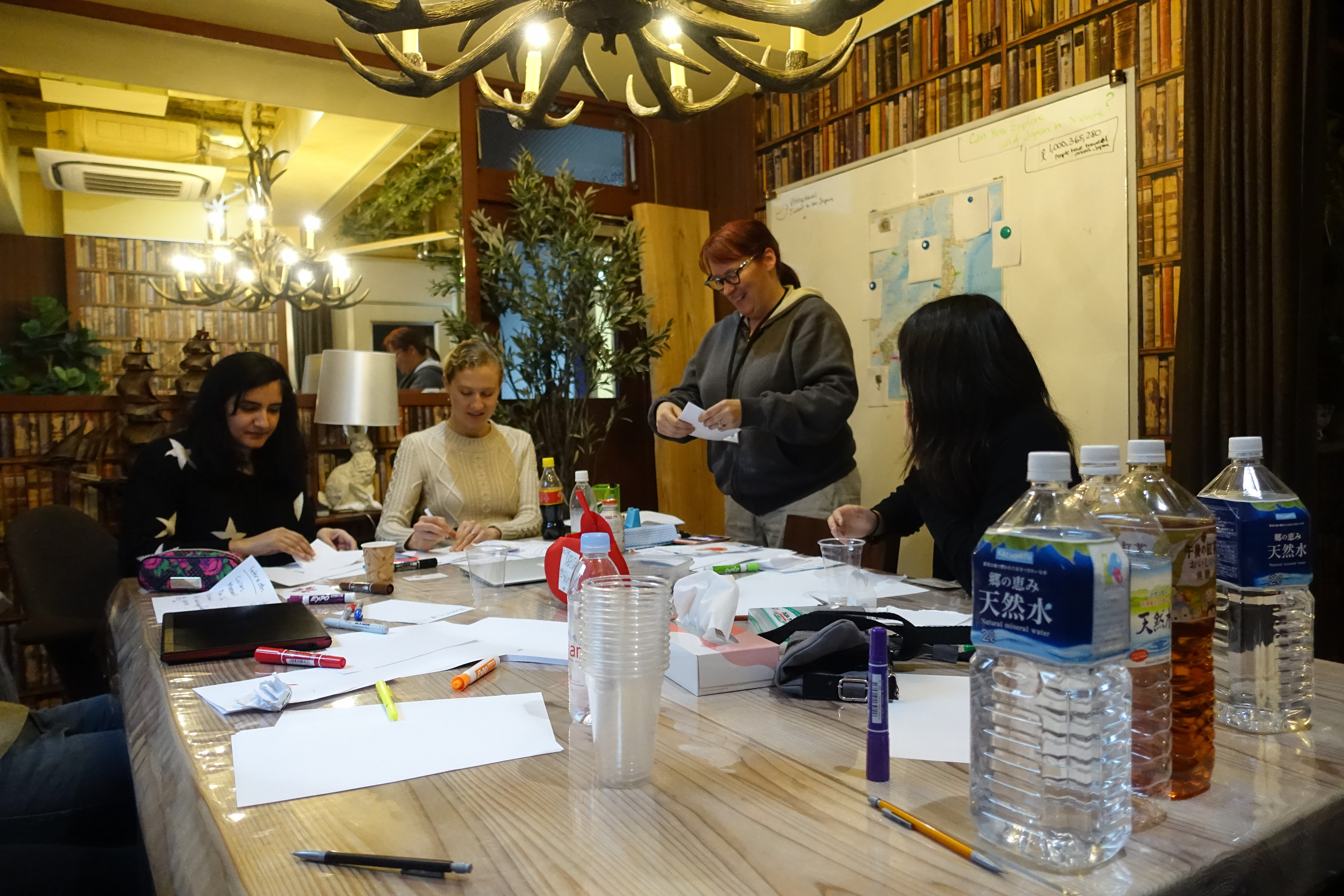
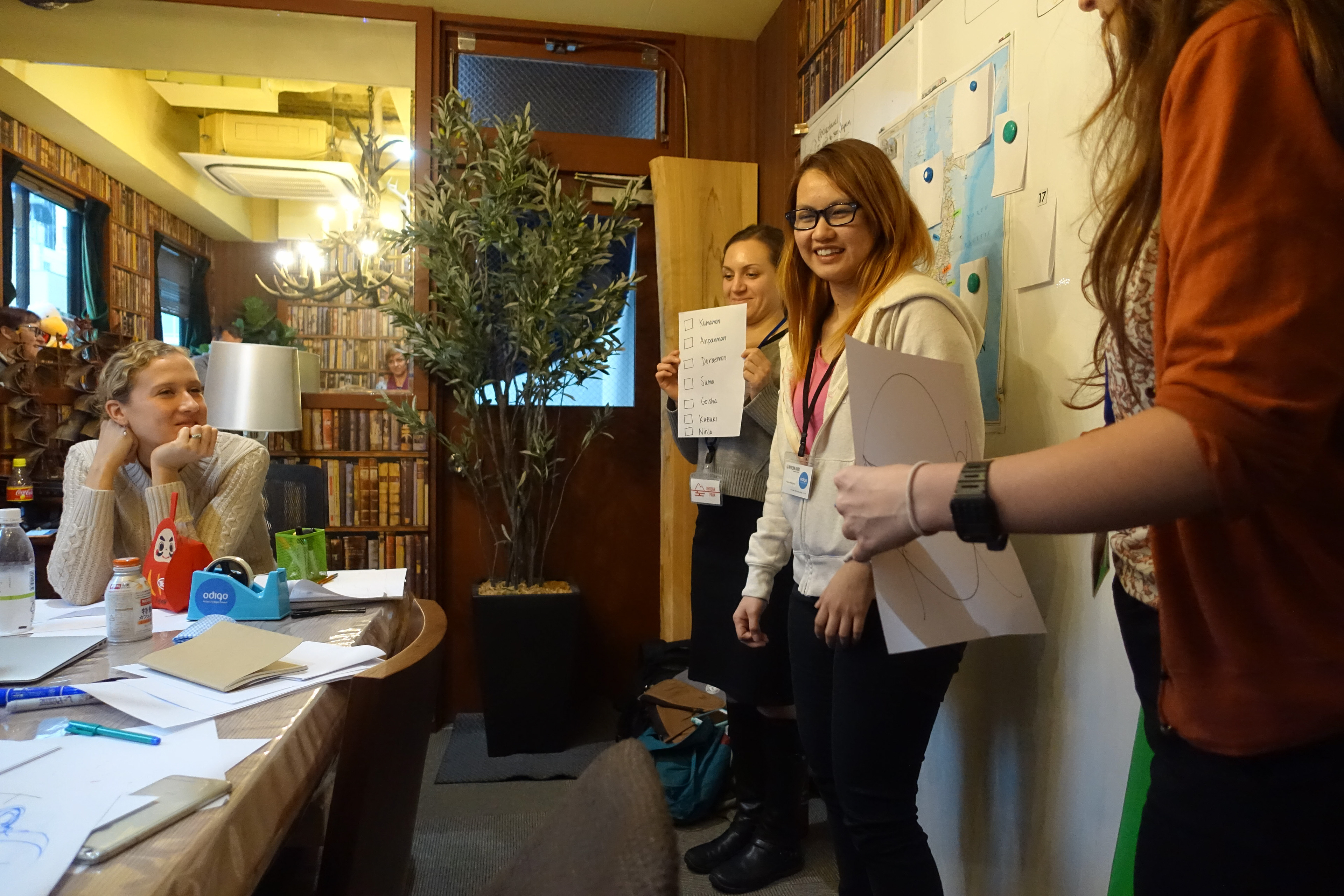
We collected a range of pain points from our research and brainstormed ways of addressing them quickly. We started by focusing on our opportunity areas and listing as any contexts we could. Then we moved on to sketching out concepts in a visioning session. The team would verbally develop scenarios and solutions, using the context list as inspiration, as one of us would sketch them out. We alternated drawing, and in the end, we developed a lot of different concepts.
We narrowed down to 12 ideas to move forward with and created short video vignettes to encapsulate each one. We used the videos to conduct speed dating sessions with users and the Odigo team to gather feedback. From the feedback back we learned that people don’t want their privacy compromised, they don’t want to have to be constantly looking at their devices while exploring, and they want help in the moment.
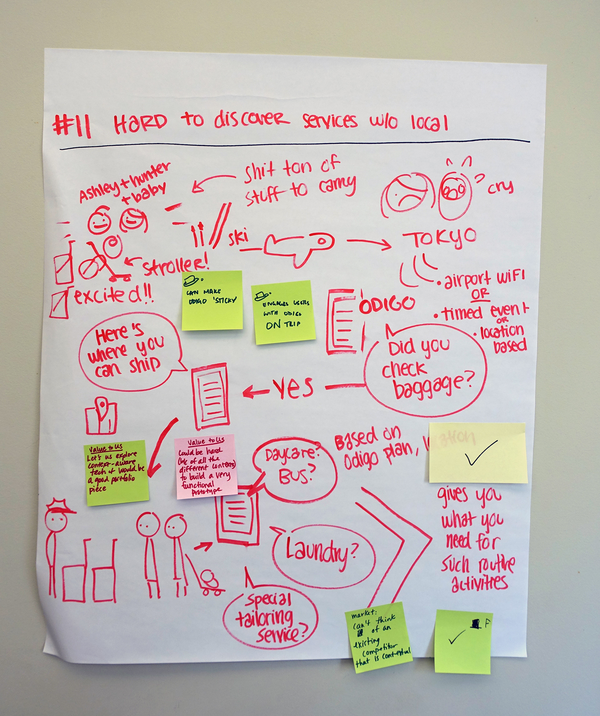
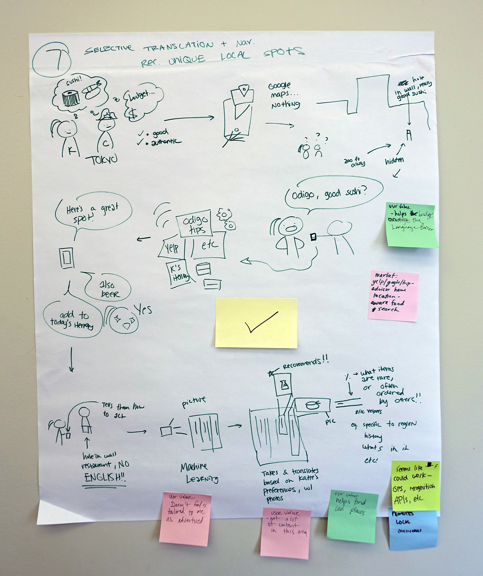
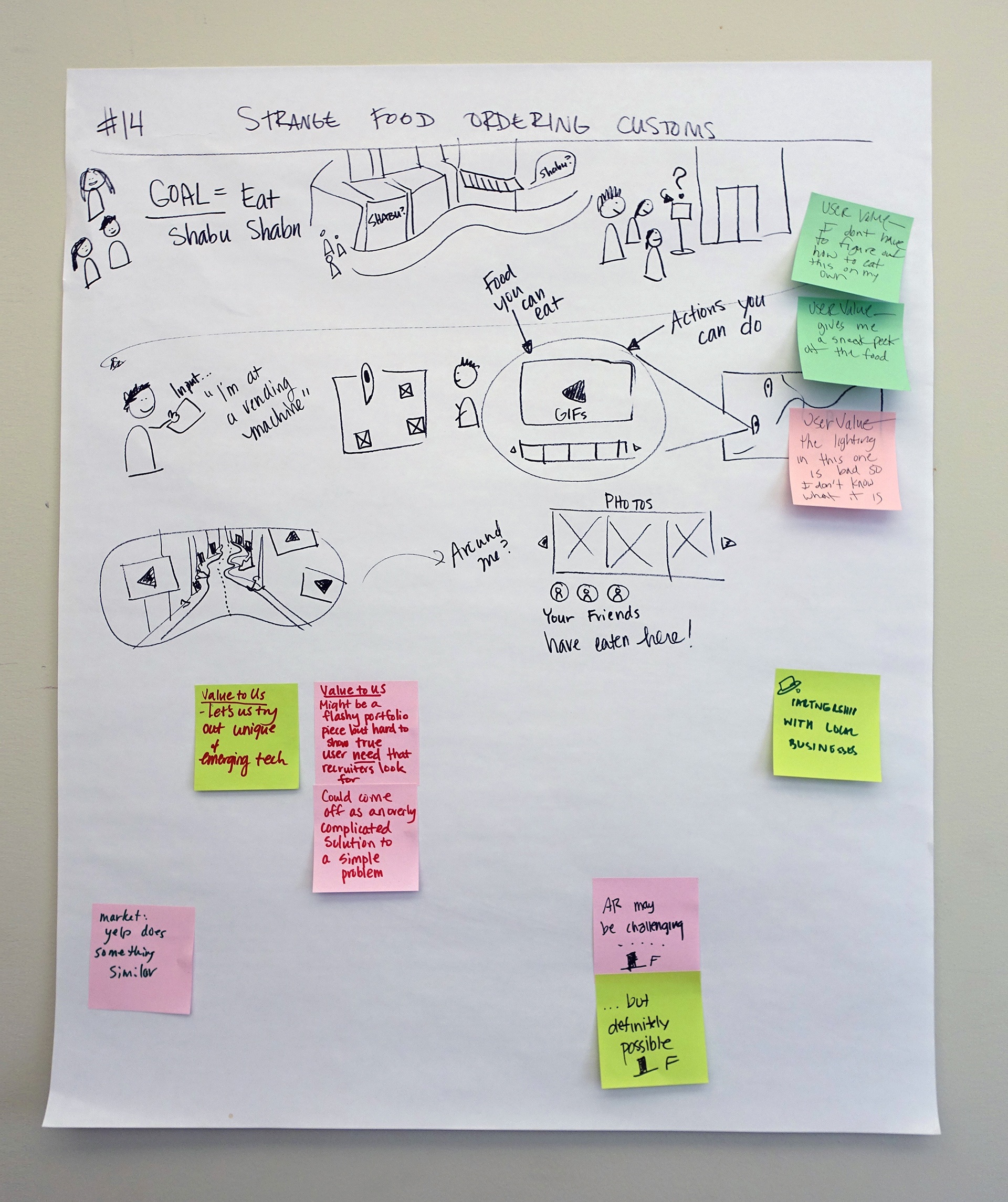
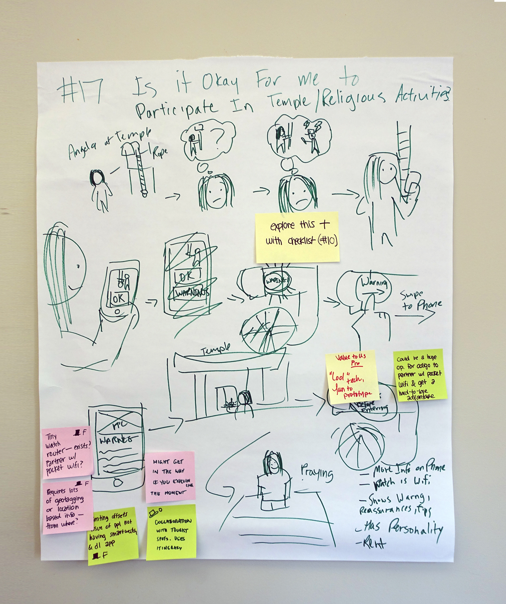
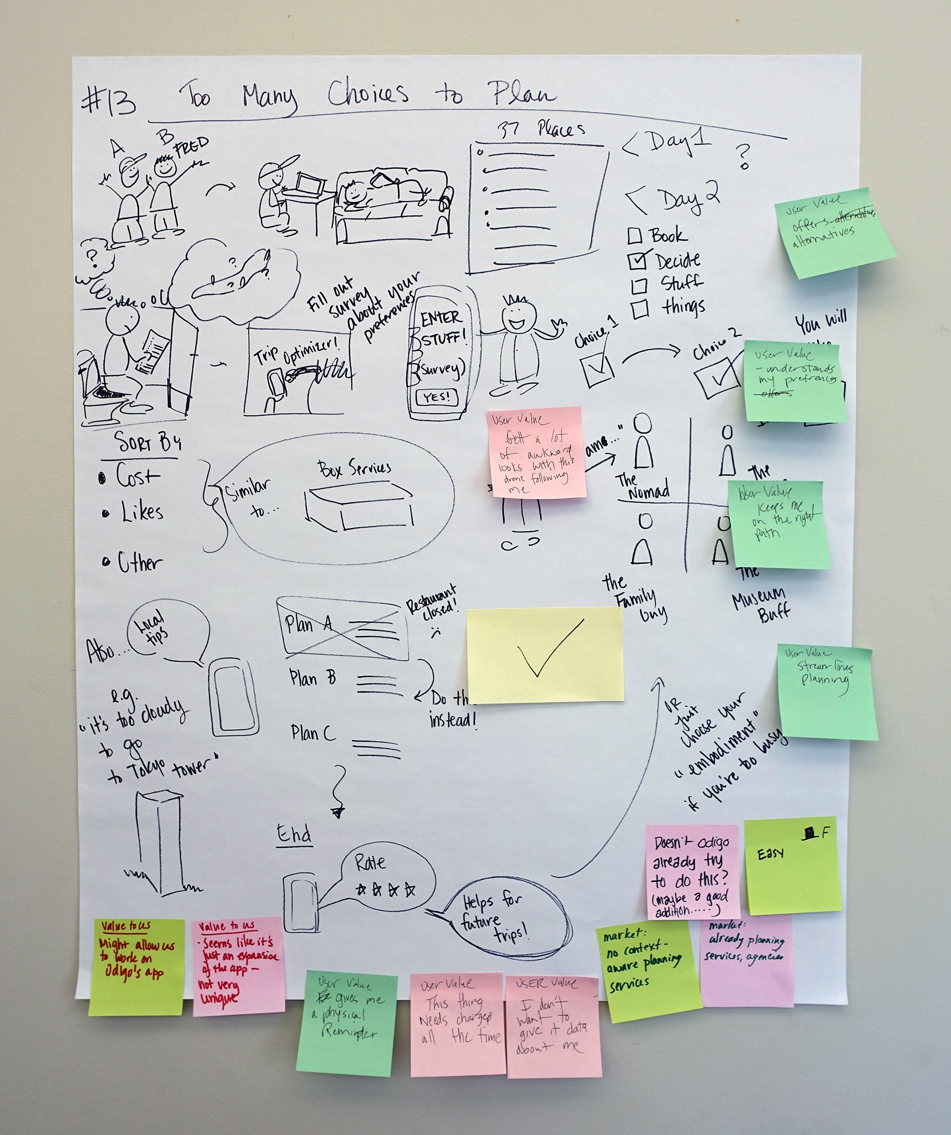
During the visioning sessions, we would improv solutions to different scenarios tourists experience while one of us sketched the developing concept.
This a playlist of the vignettes used in the concept speed dating sessions.
Nobody wants a barrage of notifications.
In response to our speed dating feedback, we decided we needed to learn about privacy, notifications, and medium. We created a variety of low fidelity prototypes that would utilize different levels of technology to explore these themes. Our big takeaways from testing these prototypes were: People don't like having their information on display and worry about how much personal data they give to applications. Tourists find notifications intrusive when they do not lead to clear actions. In-depth procedural tasks are hard for tourists, and instructional information needs to be short and easy to comprehend.
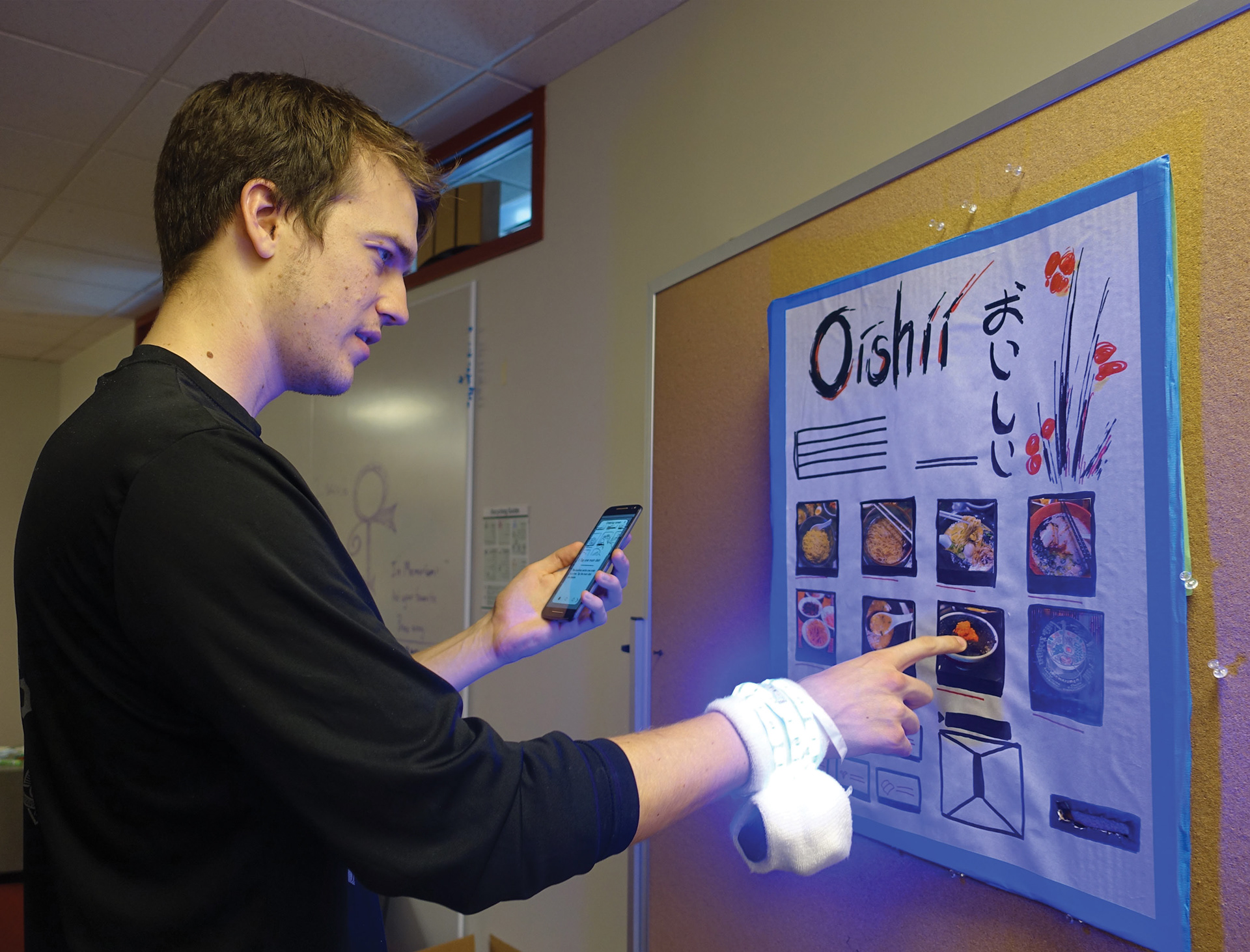
We used a variety of lo-fi prototypes to explore technologies and refine concepts.
Odigo needed a solution that they could move on quickly.
Using the results from our speed dating sessions, market research, and low fidelity prototypes we initially judged our solution concepts based on the following criteria: value to Odigo, market opportunity, feasibility, and value to users. This decision took a bit longer than anticipated. We didn’t have a clear direction on time to market from Odigo, and we couldn’t agree on what provided the most value to Odigo. So we ended up gauging our concepts twice. The second time around we included an estimation of time to market for each concept and got a clear direction from Odigo on their preferred time to market schedule.
Odigo is a small startup, a product that could get to market quickly provided them with the most value. So, we moved forward with prototyping a mobile application that would deliver in the moment help, and if time allowed, we would also explore expansions to peripheral devices that would act as triggers. The triggers would be ambient notifications to inform a user that there was relative information available.
Providing a sense of continuity when the team is focusing on different tasks was important.
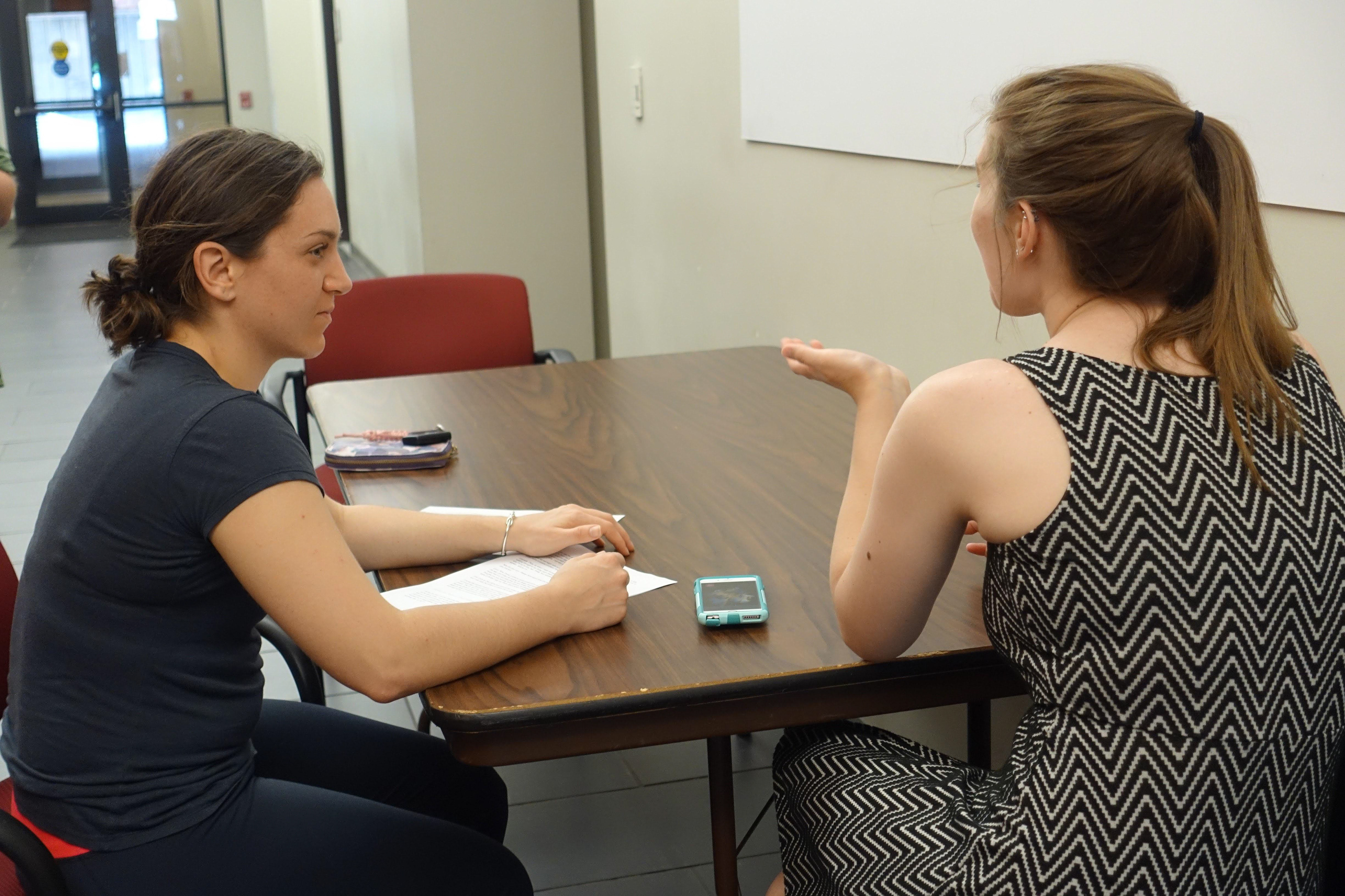
We had an idea of what the interface could be from our low-fidelity prototyping, but it needed fully fleshed out which included developing content. The team was split up into two smaller groups. One focusing on the interface design and the other on developing the content and usability test. I worked across both groups, acting in more of a mentor role because of my experience writing and facilitating usability tests along with developing the click-through prototypes for the testing.
I participated in white-boarding sessions to brainstorm the flow of the app and gave feedback on the wireframes and usability test protocol. We created click-through prototypes and completed two rounds of usability testing with mid-fi prototypes. The goal was to learn if people could understand the purpose of the app and how to use it. We observed the successes and failures and made improvements between each iteration.
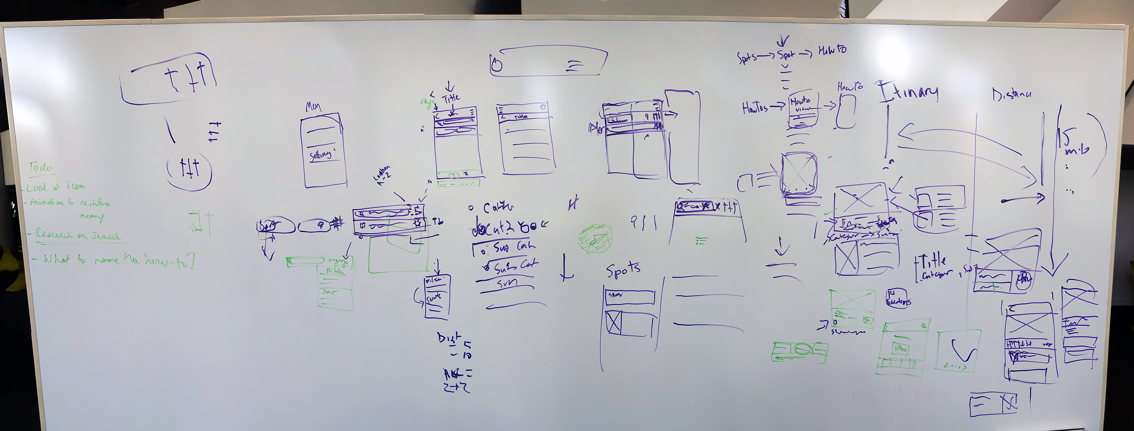
We collaboratively sketched out our initials ideas for the app's interface.
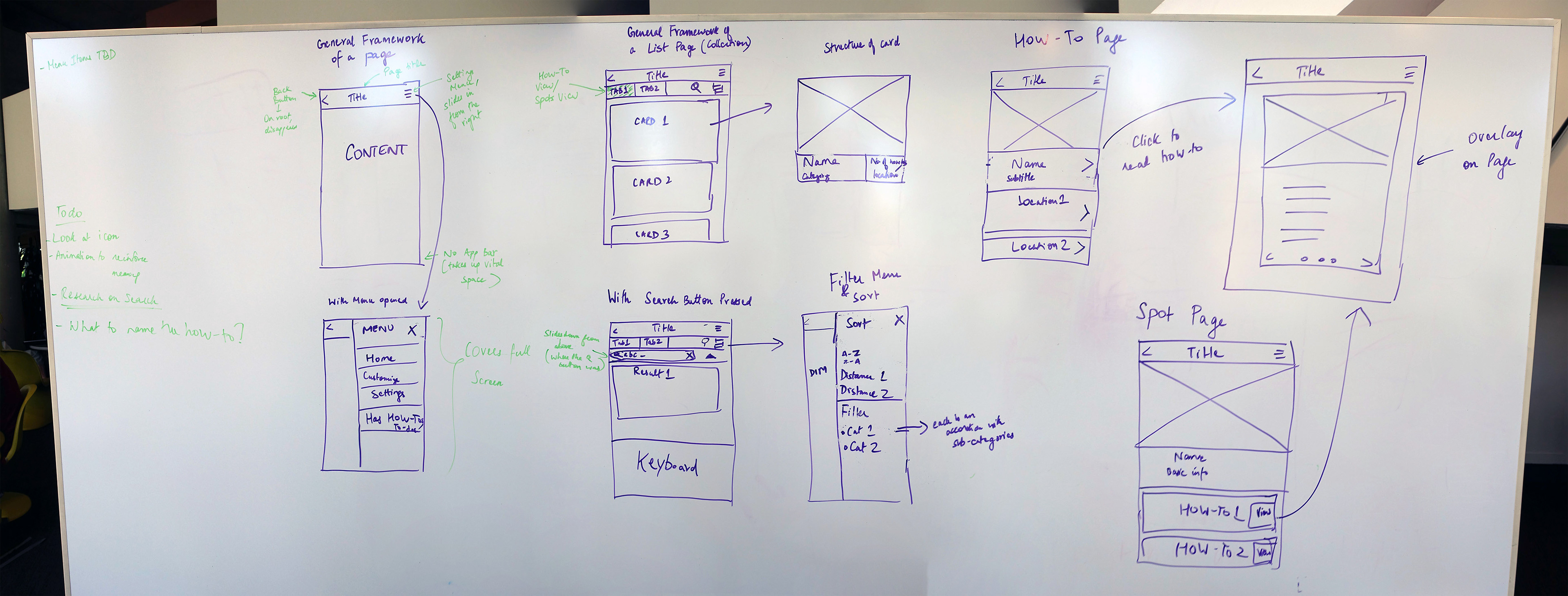
We iterated through the wireframe sketches until we had enough of the had a good base to use for the click-through prototype.
The app needed to focus on delivering one type of content clearly and communicate the value it provided.
The first iteration of the mid-fi prototype provided both informational and procedural information. When we tested the app with users, we discovered that the inconsistency of information made users question what exactly they were getting from the mobile app. The app needed to focus on one delivering one type of content to provide clear value. The feedback from the participants was that procedural information was the most valuable. Which also aligned with the feedback we got in our concept speed dating sessions.
In the first round of iteration, we also learned that the labels used for the main features were too generic and that our onboarding process was confusing. We needed to use more accurate labels and streamline our onboarding process. Participants also indicated they wanted onboarding to teach them how to use the app and communicate its value as well. We fine tuned the labeling and onboarding through the second and third rounds of iteration.
We conducted multiple rounds of usability to refine our concept.
Odigo wanted the app we designed to stand alone apart from their app.
Odigo wanted to treat this as a separate service from their itinerary planning service. So, we needed to develop a name and visual style for the app. During the last two iterations of click-through prototyping and testing, Angela and I also worked on choosing a name and developing a visual style. We had three goals: pick a name that made sense, develop a visual style that was bright and soothing, and use typefaces that read well on screens.
We each came up with some color palettes and type choices and applied them to the wireframes. Then we critiqued them together and chose a few of the strongest options for Angela to explore more. At this time I was working on the summer book and didn’t have the capacity to help with more iterating. Once Angela was ready we reviewed the new options, and I provided feedback. We iterated like this a few times before we were both happy with the results and then applied the styling to all the wireframe. We used the styling in our final prototype too, which was a working iOS prototype.
For the name, we researched the tourism market to make sure we didn’t use something similar to a product that already existed. It was pretty tough to find something that was unique, made sense, and that everyone on the team liked. We ended up using our team name Abeo, a Latin verb meaning to depart, go away, or go forth. I the found word while researching gods of travel.
We had to present to the client one final time and produce a booklet focused on our solution.
Again I was the designer for the booklet and sometimes editor, but we took a different approach to the content. Katherine and Katie developed all the copy and recruited the rest of us to develop visual models as needed. I worked on some of the models with Katie. Also like the last time, the team was instrumental in the design of the booklet. They provided useful feedback as I developed the overall design.
We modified the content from the book to use in the presentation. I helped with cleaning up the slide design, but Ajayan did the majority of the work. During the presentation, we did a small of the working iOS prototype developed Angela, Ajayan, and Katherine. The app had tasks near the school. After the presentation, we took the Odigo representatives out for a live demo around campus.
Post Project Assessment
What went well?
Everyone on the team was willing to adapt to any situation and play different roles. Initially, I was actually against this idea, but the rest of the team’s willingness to work outside of their comfort zones convinced me to do the same. Also, we didn’t always get along with each other, but it never affected the work, and in the end, we had a great solution that excited Odigo.
What could have been different?
We had a difficult time coming together on the direction we should take the solution. I think a lot of that was a result of the clash between MHCI Program’s push to be experimental and the reality of developing a solution for a client. While most of the team wanted to go really blue sky, I was always concerned about how realistic was it for Odigo. Eventually, we came to a good compromise, but only after we asked Odigo about what would be best for them. We should have reached out to Odigo about that much earlier in the process. It would have saved us all a lot of time.
What’s next?
We provided Odigo with a working prototype that they could use as a starting point, and a plan to expand the service in the future. That ended our role in the process. While we were working on our project, Odigo did a massive redesign of their itinerary planning app to make it more usual in country. The redesign included an improved navigation tool. It would be easier for them to manage one app rather than two. Based on expanded features in the redesign, if I were in their shoes, I would start integrating some of the features from the Abeo app into a future release of their app.